How to create multiplots in Stata
How to create multiplots in Stata
Welcome to the Stata Guide on creating multiplots in Stata! When running analyses in Stata, you’ll often want to create a visual representation which combines all of your findings into one clean graphic. This can be accomplished through the use of Stata’s graph combine command which we will learn the details of throughout this guide.
Throughout this guide, blue phrases will be used to indicate commands, green phrases for variables, and purple for links and downloads.
We’ll be using a dataset built into Stata called ‘lifeexp.dta’ to learn the reclassifying process. This is a dataset which includes information on life expectancy via six variables.
Here is the .do file with all the steps covered within this guide.
Learning about the Data
Let’s begin by loading in the data and examining its variables and properties. Running the following will load the data into Stata’s main page.


You should now see that the dataset’s six variables have populated the Variable window on the right side of the main browser window. These six variables are region, country, popgrowth, lexp, gnppc, and safewater. We can check the labels adjacent to each variable if we are unsure of what the variable names represent or can run the browse command to load a new window with a spreadsheet display of our data.
browse

We can see our six variables and observe what each represents. The region variable has classified each country variable by region code, or continent. country is simply the full country name, not classified by country code. popgrowth is a variable holding information on annual population growth as a percentage; this is why the range of its values might appear small. lexp is representative of life expectancy in years while gnppc holds gross national product per capita. Finally, safewater is representative of the percentage of the population with access to clean drinking water.
Now that we’ve explored the variables included, let’s brainstorm some graphs that would be interesting to create.
First, we could begin by exploring the differences between the highest and lowest gross domestic product per capita countries represented in the dataset; this would be interesting particularly as we are creating multiplots which allow for easy comparison across the graphics we’ll create.
We will aim to make the following sets of graphs to explore this guiding question:
Q: How does life expectancy (lexp) differ between low and high gross national product per capita (gnppc) countries?
Let’s move on to filtering and sorting our data before we make graphs to explore these broader questions.
Filtering and Sorting the Data
We will first need to sort and separate the countries with the highest and lowest GNPPCs from one another. From running browse earlier, our dataset is currently organized alphabetically by country name. To begin sorting and filtering, let’s use the gsort command and run the following:
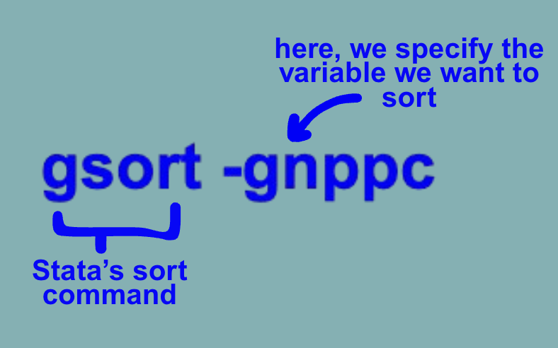

We have now sorted our gross national product per capita variable from highest to lowest. Amongst the countries with the highest GNPPCs are Switzerland, Norway, Denmark, the United States, and Austria while the lowest include Armenia, Haiti, the Kyrgyz Republic, Moldova, and Tajikistan.
It’s now that we might notice that when we’ve sorted, the countries with no information listed for GNPPC have also been brought to the bottom.

We want to be careful not to count these and so we will run the following to drop them:
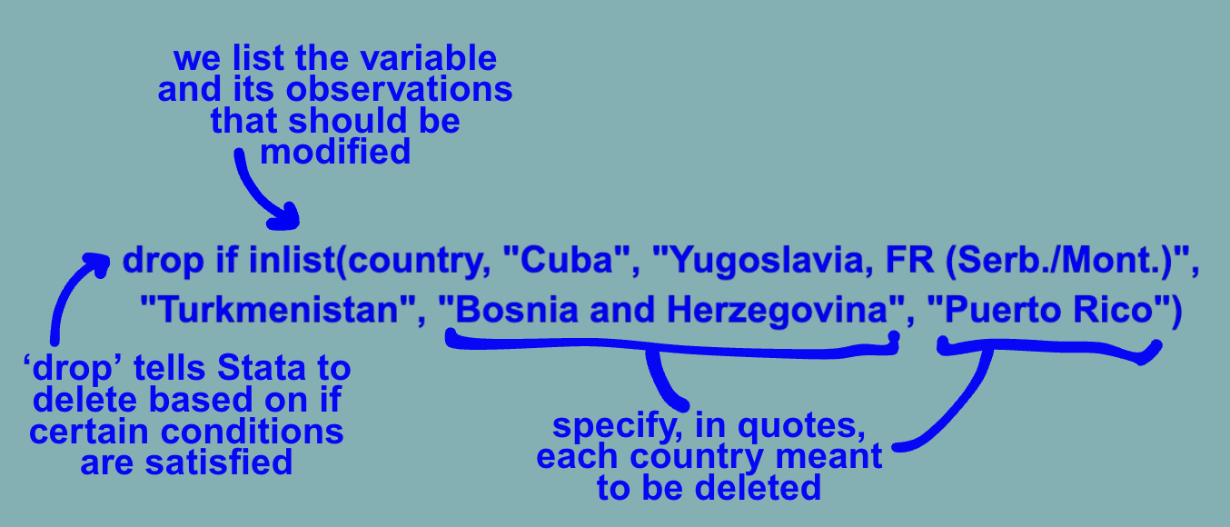
We can now observe that the entries in rows 64 through 68 were successfully dropped and the countries at the bottom accurately represent the lowest post-sorting.

Maybe we are interested in comparing the top ten and bottom ten against one another. We will next have to remove all the countries which do not fall within these ranges. To do so, we’ll combine the keep, if, and inrange commands as follows:
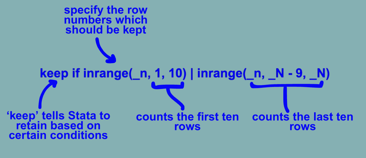
We can now observe that the only remaining entries within our dataset are the twenty countries falling within the top and bottom ten gross national products per capita respectively.

We’ll also make a new variable called low-hi to label whether a given country has low or high gnppc (where 1 = high and 2 = low) by running the following:

Now that we have successfully sorted and filtered the data, we can move on to making our graphs.
Creating the Initial Graphs
As we are interested in graphically representing the difference between the life expectancies and population growth of low and high GNPPC countries, we can start with deciding which type of graph will best display these differences. A scatter plot is a useful tool for creating a visualization through which we can easily compare two variables (gnppc and lifexp in our case. Let’s make one by running the following:

We can now see a pop-up of our graph between GNP per capita and life expectancy at birth.

We can observe that all lower GNPPC (group 2) countries have lower life expectancies than high GNPPC countries (group 1). This observation could be supported by running the creation of a bar graph displaying the means of low and high GNPPC countries for comparison.

We now have a second graph which illustrates the relationship between life expectancy and GNPPC in a different way.

We can now move onto combining the two graphs.
Combining the Graphs
To combine our two graphs, we will be using the graph combine command:
graph combine scatter bar
We have now successfully combined both of our graphs into one output!

Congrats on making it to the end of this ERC Stata How-To Guide!
For more How-Tos on using Stata see here:
- How to: Reclassifying Variables in Stata
- How to: Clean Survey Data in Stata
- How to: Append and Merge Data in Stata
- How to: Use Multiple Frames in Stata
By: Zoe Pyne