Data Analysis & Visualization in Stata
What is ![]() ?
?
 ?
?Stata is a statistical software used for data manipulation, visualization, and statistics, and can be helpful for exploring, summarizing, and analyzing datasets.
Stata operates through commands, or instructions for manipulating data. Through these commands, you can summarize data, create new variables, and run statistical testing. Commands in Stata can be run through the command tab at the bottom of the software or through a Do file (ending .do) which can be exported and saved for revisiting your code in the future.
Here is what will be covered throughout the guide:
Table of Contents
I. Introduction
A. Downloading Stata and Workshop MaterialsB. Beginning to Work in Stata
C. Setting the Working Directory
D. Guidelines for Data Importing in Stata
E. Opening and Creating .do Files
F. Running Commands in .do Files
II. Data Cleaning & Common Commands
A. Viewing the Data1. Data Types
B. Tabulating Variables
C. Formatting Dates and Filtering Years
D. Dropping N/As
E. Encoding Variables
III. Data Visualization
A. Creating a Scatter PlotB. Creating a Histogram
C. Additional Data Visualizations
IV. Correlations and Regressions
A. CorrelationsB. Univariate Regression
C. Multivariate Regression
1. Interaction Terms
Downloading Stata and Workshop Materials
Stata is a paid software that requires a license for use. There is a student discount, but no free student version of the software. Here are some locations on campus where you can access and use Stata for free:
- Barnard’s Empirical Reasoning Center (Milstein 102)
- Columbia Library Computers (various locations)*
*check Stata availability on Software in CUIT Computer Labs and Clusters
Stata can be accessed remotely without downloading via Barnard’s Apporto or through Columbia’s virtual lab access services.
Here are the links to install Stata on your device:
Windows: Install on Windows
Mac: Install on Mac
Once you’ve accessed Stata, move forward to begin learning how to work within the program!
.do File: This is the .do file for the tutorial below. Download it to follow along.
Data: For this guide, we will be working on a dataset of DOHMH from the Department of Health and Mental Hygiene (DOHMH) found on NYCOpenData that can be accessed here.
Throughout this guide, light green phrases will refer to variable names and blue phrases will refer to commands and complete lines of code (including variables). All links are purple.
︎︎︎
Beginning to Work in Stata
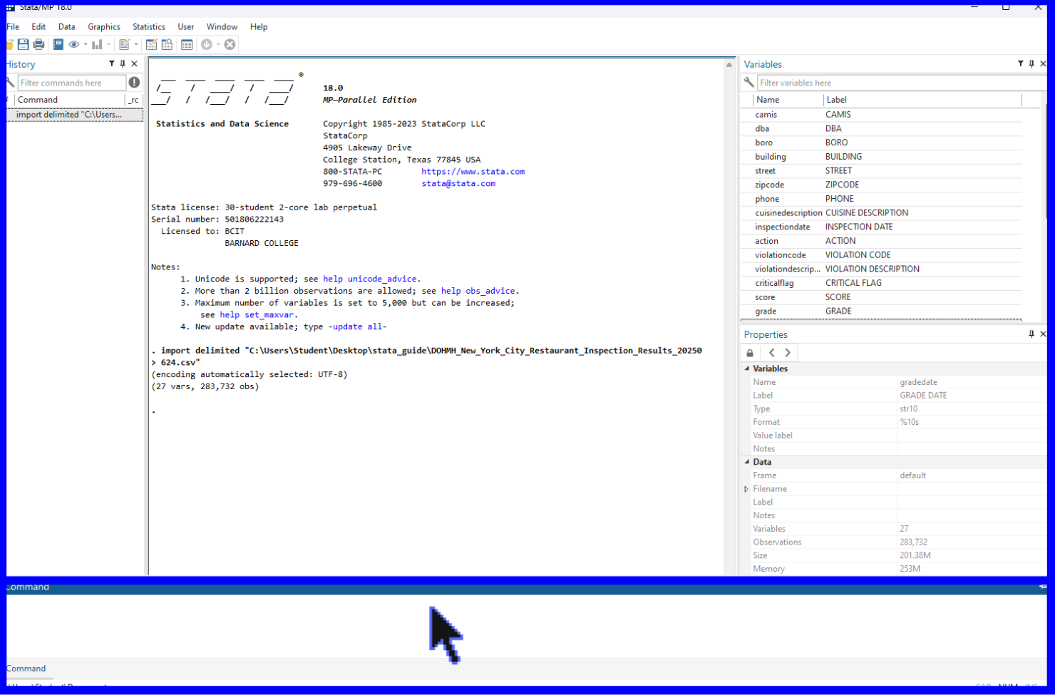
The dataset we will be working with is from the DOHMH and contains information on restaurants’ sanitary scores over time. Additional variables include those which list their names (dba), location (boro, building, street, and zipcode), cuisine description (cuisinedescription), and scoring information (score, grade, action, violationcode, violationdescription, criticalflag, etc.). Grades are assigned in letters to restaurants as a result of health inspectors’ scores (see here for more information on scoring and their respective letter grades). It is important to note that a lower score corresponds to a better letter grade. Restaurants are inspected at least once a year but are unaware of the date when they will be inspected (hence the staggered inspection dates within the data). Cuisine descriptions are (optionally) self-reported by the restaurants, therefore there might be some error introduced when aggregating and examining how different cuisine types impact a restaurant’s score. The research question(s) that we will be examining throughout this guide is:
Q: How do restaurant ratings change over time?
Subquestion: How do restaurant ratings change over time as separated by borough?
To do so we will be conducting various data cleaning tasks, learning how to visualize our data, and conducting regression analysis.
Download the data to a folder titled, “Stata Workshop” that you will easily be able to access. This folder will be set as Stata’s reference for where to pull files from throughout the rest of the guide (a.k.a. the ‘working directory’). The data is a Comma-Separated Value (CSV) file and is ready to be imported directly into Stata.
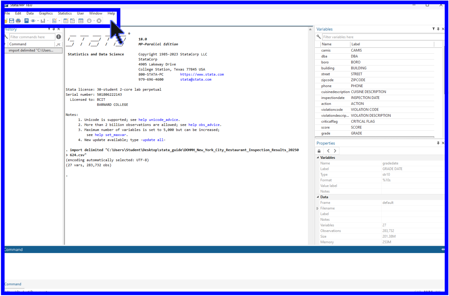
Let’s begin with a short overview of the program’s interface. There are five main windows in Stata:
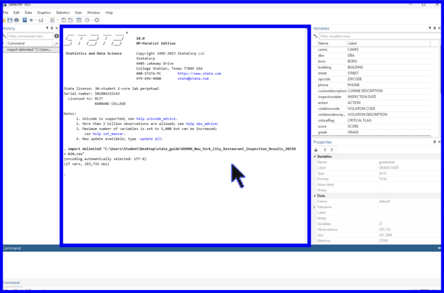
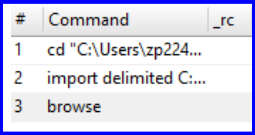
1) The History window allows you to view a complete history of commands ran. When opening a new Stata page, this section will remain empty until you have run a command. Clicking on any command in this history provided by this window will cause it to populate in the Command window found at the bottom of the interface.
2) The Results window shows commands that have been run alongside their output (i.e. tables, textual results, etc.) and can be found in the center of the interface.
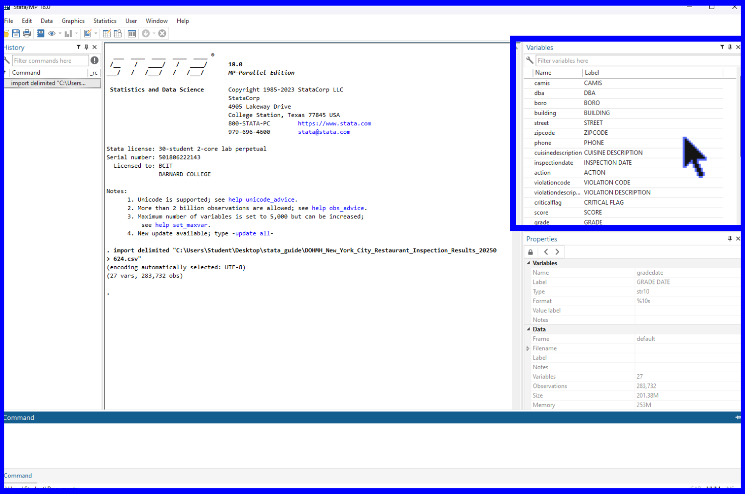
3) The Variables window displays a list of all the variables found within a loaded dataset. Before you have loaded in a dataset, this section will remain empty. The new variables created throughout this tutorial will populate here as well.
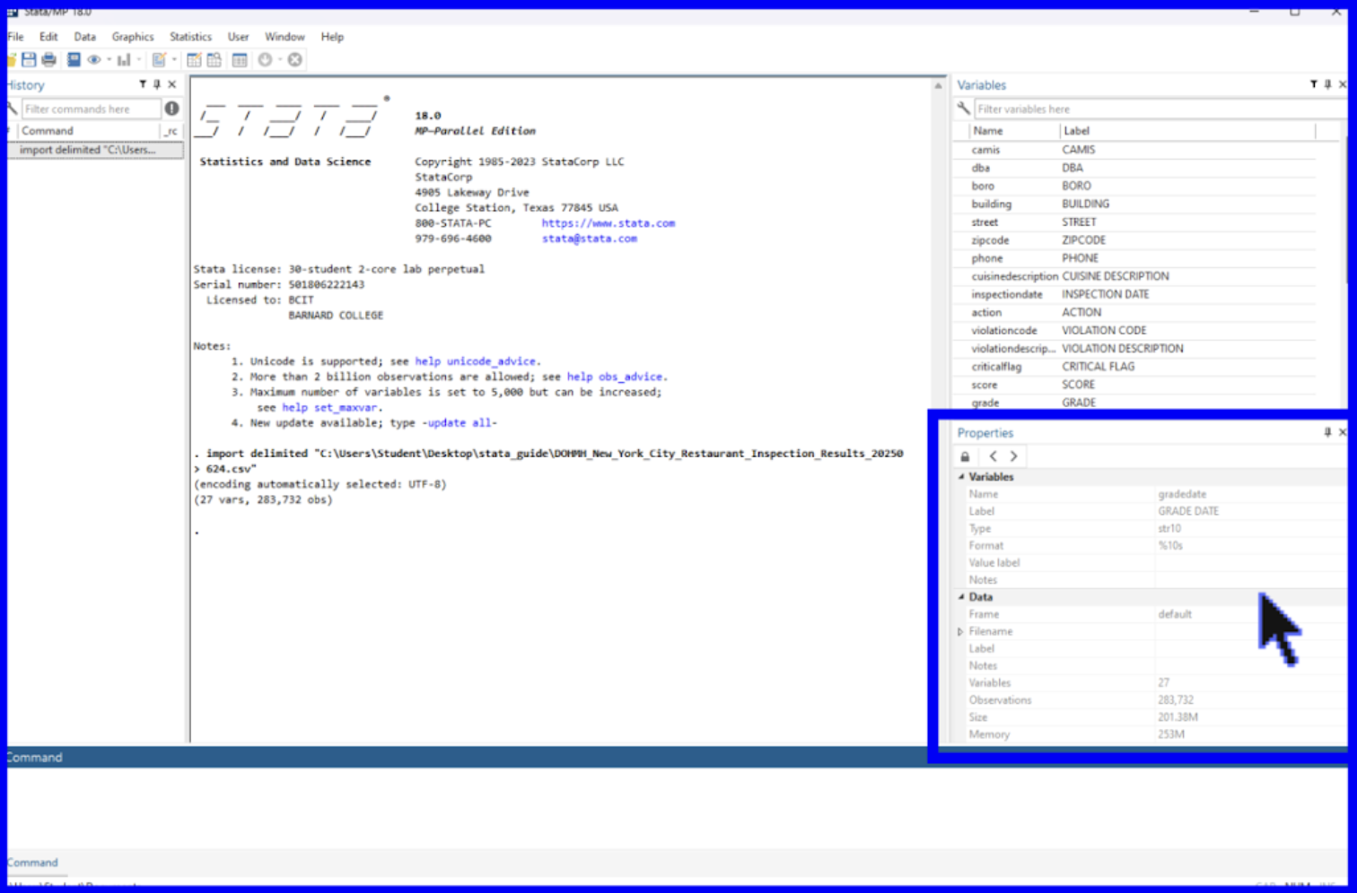
4) The Properties window summarizes the details of a given variable or dataset. When selecting a single variable from the Variables window above, its properties will be displayed in this window. If instead multiple variables are selected at once, the window will instead populate with properties that all the respective variables have in common.
5) The Command window is where certain commands can be entered to be run by Stata and returned in the Results window. We will later review how a .do File Editor functions as another option for running commands.
The toolbar, found at the top of the interface contains several common functions we will learn more about later including Open, Save, Print Results, and Log.
Now that we’ve covered each area of the interface, we will move on to learning how to set the working directory.
︎︎︎
Setting the Working Directory
Setting the working directory is an important preliminary step in working with Stata. The working directory is how Stata finds the files and data you are working with (through something called a file path). It is a folder where all the files relevant to your project are stored. By setting a working directory, you make it easy for the program to load in your data and avoid data loss.
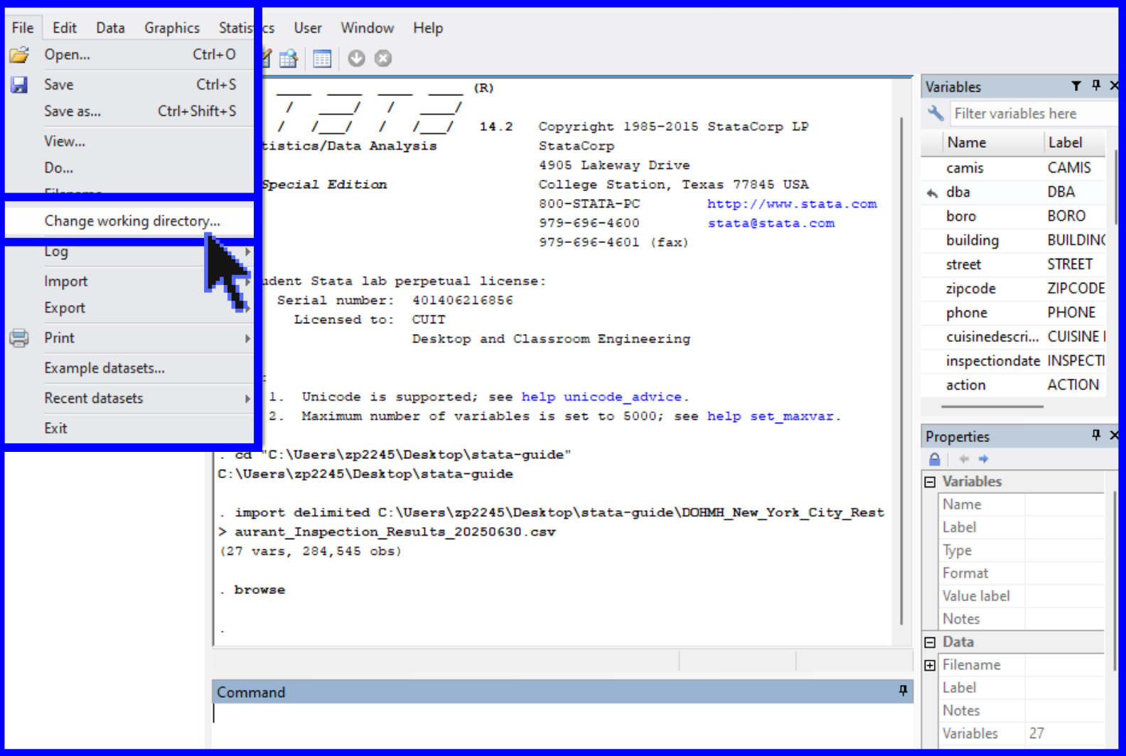
For this workshop, the working directory will be set to the folder titled, “Stata Workshop”. In order to manually set the working directory, locate the File tab at the top of the window. Locate the location of the Stata Workshop folder on your personal device. Next, select Change Working Directory and navigate to this location.
︎︎︎
Guidelines for Data Importing in Stata
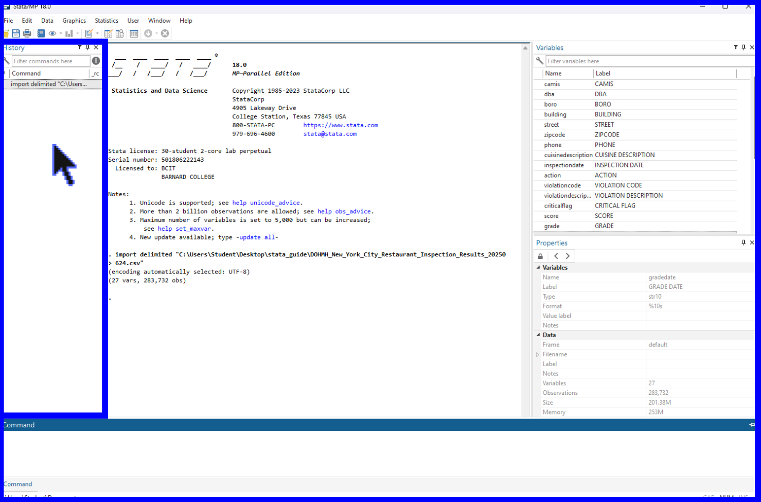
Once you have set the working directory, you can import your data into Stata. It is crucial that a working directory is set up before importing data from different file types. The general process to open a data file is to select the tab File at the top of the window and select Import. You will then select the specific type of data file that you are working with and navigate to its location on your device.
When importing a data file to Stata, you need to specify the format of the data (.csv, .xls, .sas7bdat, etc.), as shown below. Since our data is a Comma-Separated-Values file, we will chose Text Data (delimited, *.csv).
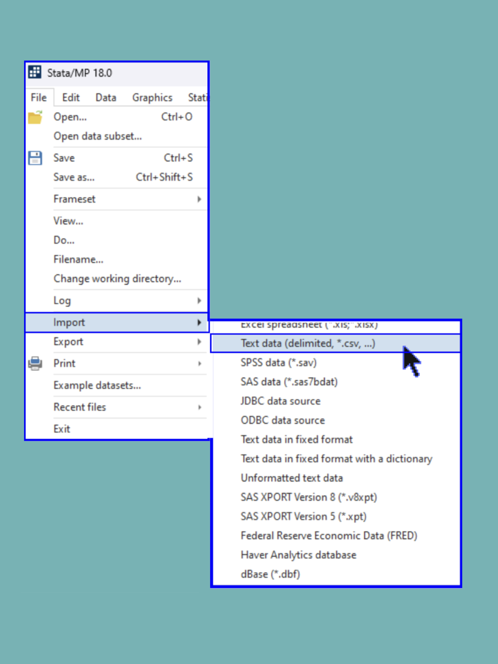
You should now see that the Variables window has been populated with the variables from the dataset and a command for importing the data has been automatically filled into the History window.
︎︎︎
Opening and Creating .do Files
As a reminder, a .do file is the code document where you can write and store a sequence of commands that process and analyze your data. A .do file allows the user to save commands and open them later. This is helpful for reaccessing code later on or when sharing with others.
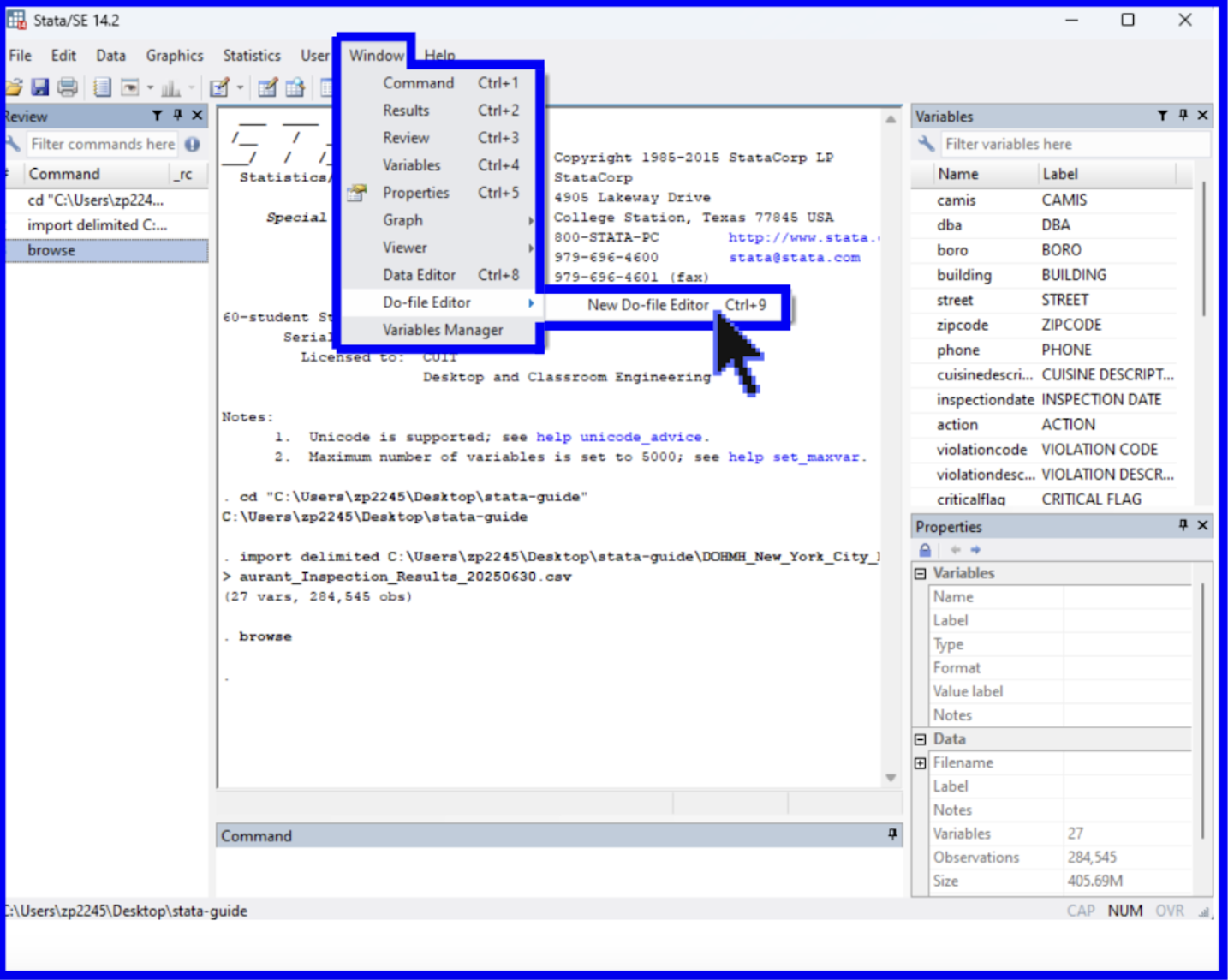
To create a new .do file, go to the Window heading, select the Window tab from the top of the browser, Do-file Editor, and click New Do-file Editor.
Once the Do-file Editor is opened, a new window will pop up and you will be in an untitled .do file. This is where you can write, run, and store your code. (If your assignment or project requires that you use an existing Stata script, you can also open an existing .do file. To do this, select the File tab at the top of the window, Open, and .do File.)
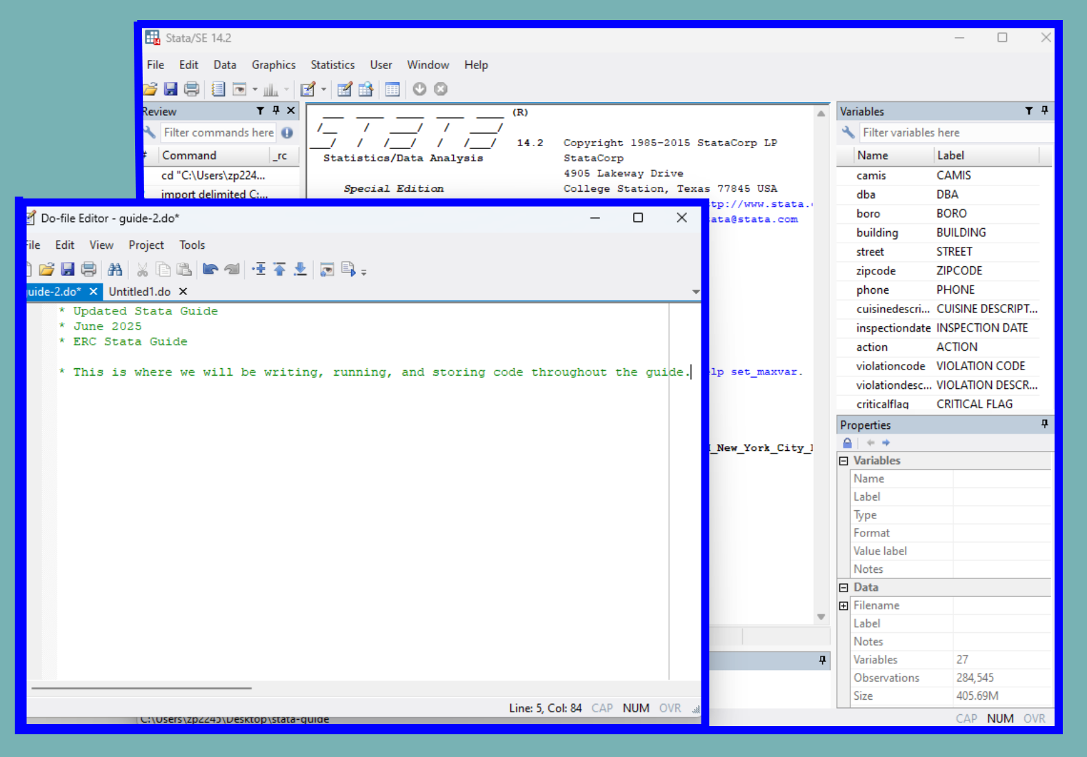
Now that we have opened up a .do file, we will move on to running commands.
︎︎︎
Running Commands in .do Files
When writing code in the .do file, you are writing instructions and steps for the program to complete.
It is good practice to run your code each several lines as you develop your script to make sure that it functions as you intend it to.
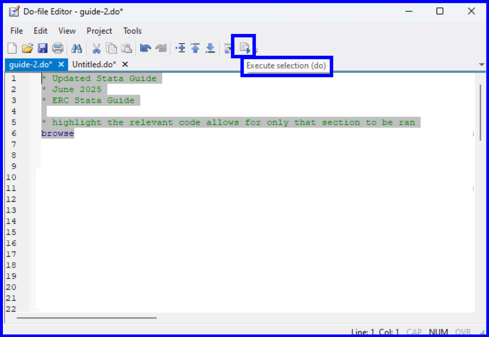
There are multiple ways to run your code within Stata. To run all the commands in a .do file, click the rightmost icon of a page with a play button. If you hover over this icon, you will see Execute selection (do). The Execute function instructs Stata to execute the commands stored in the file.
If you only want to run certain lines of code, highlight the relevant lines and select the same icon as before.
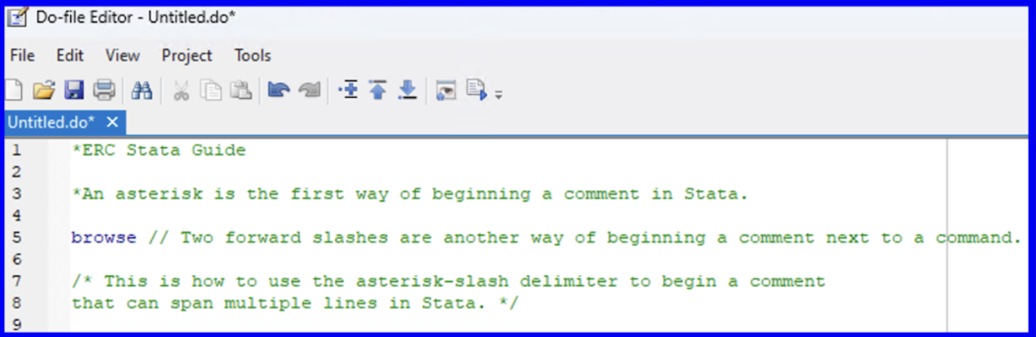
Interspersing comments throughout your commands can serve as a useful explanation throughout your .do file. Commenting will be stylized as green by Stata and will be ignored by the program when running your code. Commenting can be achieved within a .do file in Stata via one of three of the following methods:
︎︎︎
Viewing the Data
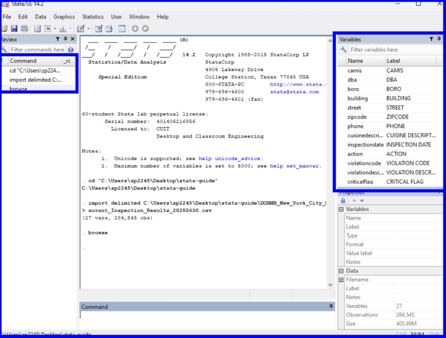
Before we begin analyzing the data, we should examine its structure. On the right side of the main window, you can see all of your variables and their labels. When a variable is selected, more information on it can be seen in the Properties window. Click on the cuisinedescription variable.
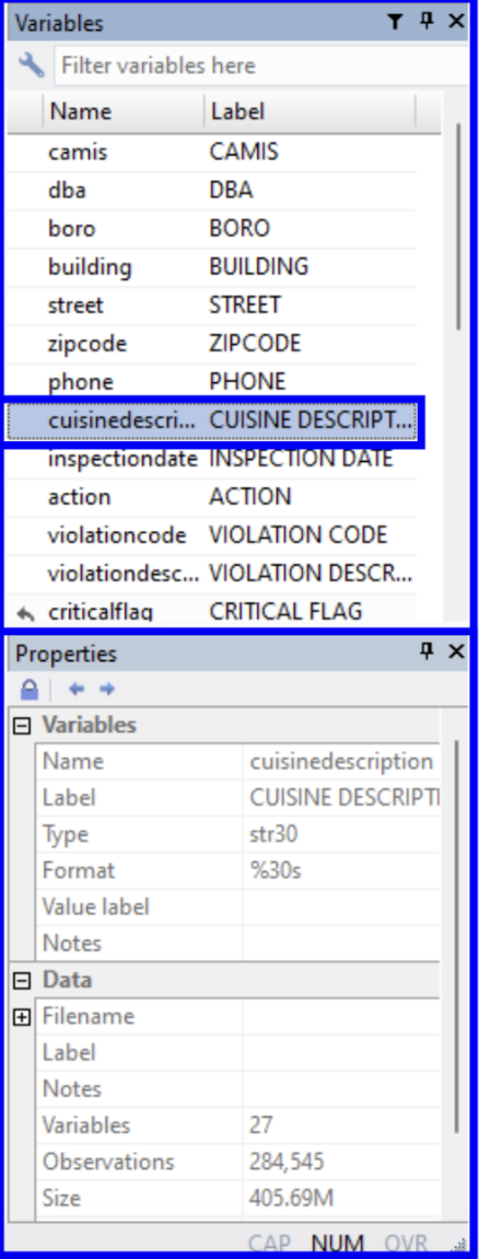
We can now observe that the variable name has been highlighted in the Variables window and its details have populated the Properties window. We can see that its variable type is a string and that the name and label match one another.
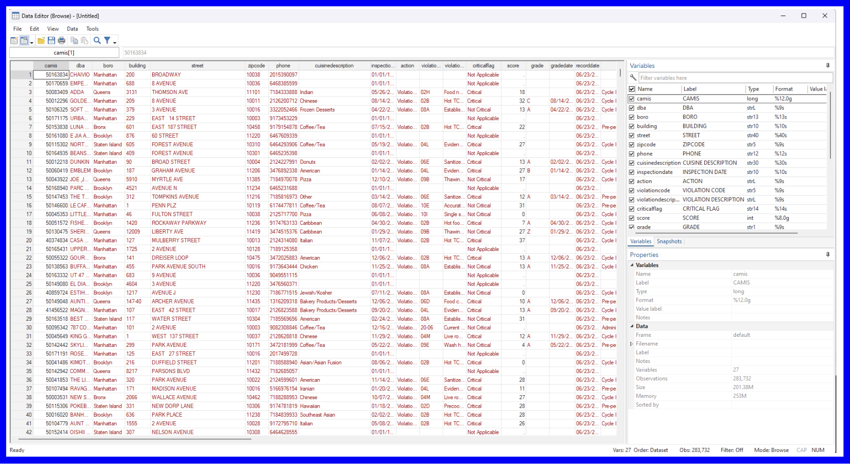
This can also be viewed with the browse command which opens a new window with a sheets-style preview of the dataset. In the command line or your .do file, enter the browse command.
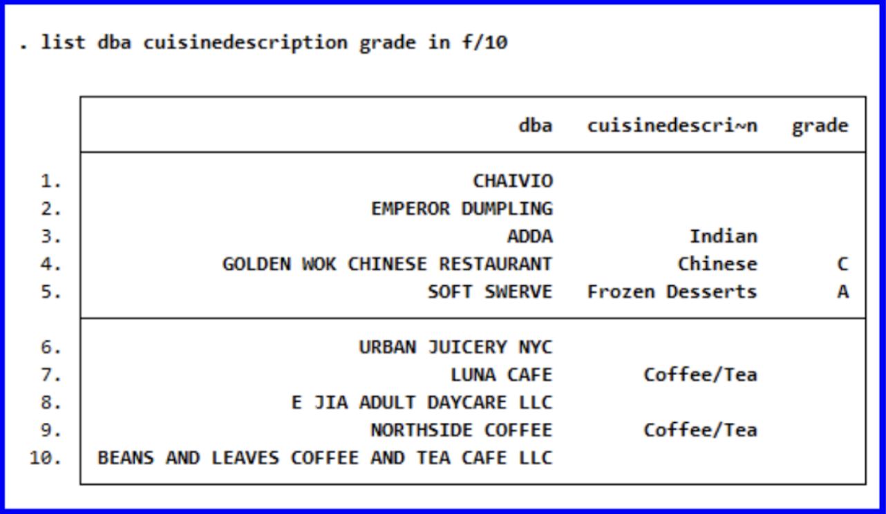
The list command is another helpful tool for displaying the values of variables within a dataset. There are several ways of specifying what you’d like displayed through this command; running the following command will cause only the values for the first ten observations of the three specified variables (dba, cuisinedescription, and grade) to be displayed in the Results window:
list dba cuisinedescription grade in f/10
︎︎︎
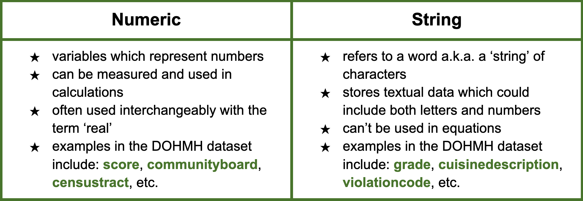
Data Types and Variable Classifications
Stata recognizes two main data types: Numeric and String.
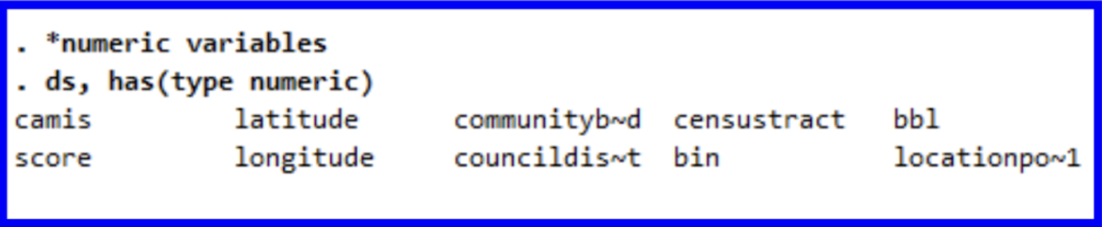
There are a variety of commands which allow you to check the data type of a variable in Stata. One of the most common methods is the describe (ds) command which returns a table with various information on a given variable. If we are interested in seeing a list of all the variables classified as numeric, we can run:
ds, has(type numeric)
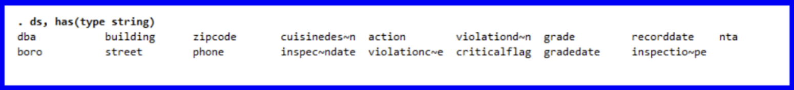
The command for seeing the variables in our dataset classified as string follows a similar pattern:
ds, has(type string)
By running describe score grade we can observe the differences between the two variables.
describe score grade
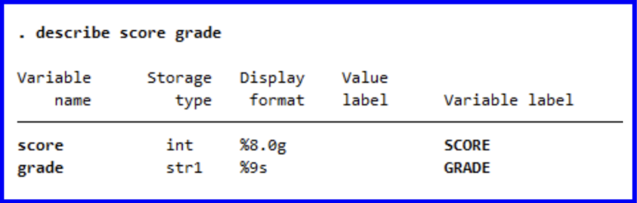
We can now be reminded of what we learned earlier about how the score variable serves as a numeric representation of a restaurant’s rating while grade serves as a string character representing their grade. New York City’s DOHMH scores based on various sanitary criteria and awards restaurants with scores in points where lower scores are better; these scores are then represented as the letter grades which can be seen posted on establishments’ windows.
Throughout this guide, we will explore a variety of factors which contribute to an establishment’s score and gain a better understanding of NYC’s restaurant ratings overall.
Throughout this guide, we will explore a variety of factors which contribute to an establishment’s score and gain a better understanding of NYC’s restaurant ratings overall.
︎︎︎
Tabulating Variables
Now that we have set up the Stata environment, we will begin to learn certain commands.
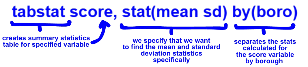
The tabstat command provides an easy method to get summary statistics. The command should be followed by the variable you want to summarize and the stats you want as follows:
![]()
The tabstat command provides an easy method to get summary statistics. The command should be followed by the variable you want to summarize and the stats you want as follows:
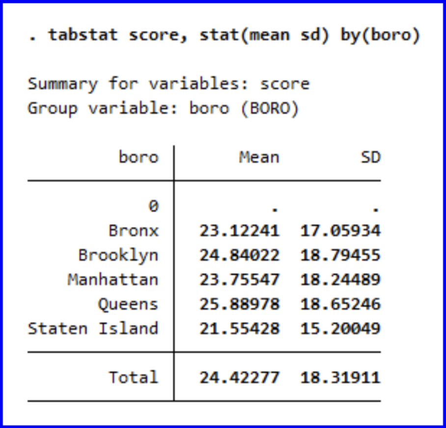
This command would generate the mean and standard deviation for the score variable.
![]()
We can observe that the ranking of mean scores across boroughs from lowest (best) to highest (worst) is Staten Island, the Bronx, Manhattan, Brooklyn, and then Queens.
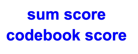
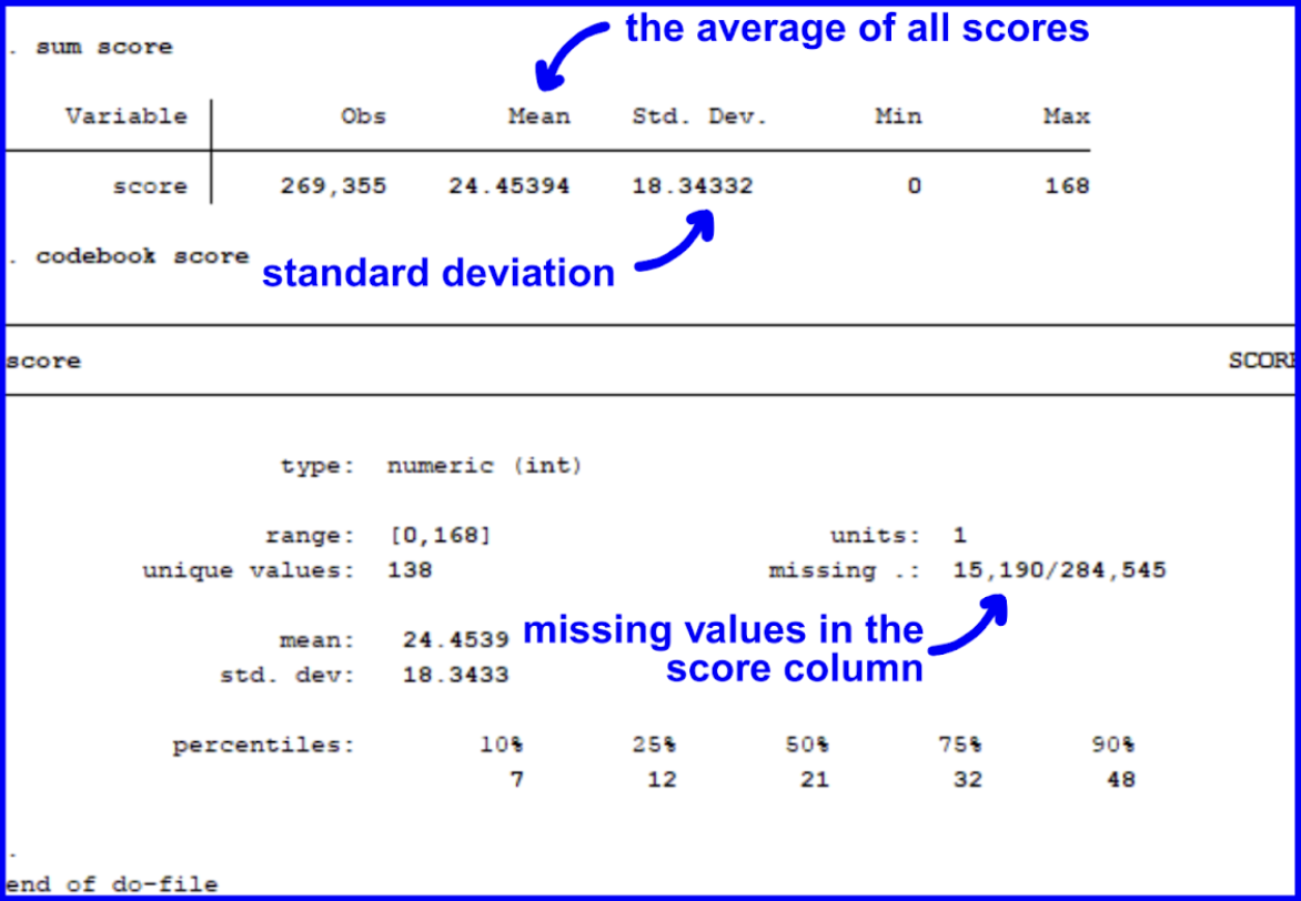
We could also learn more about a variable with the sum and codebook commands. The codebook command tells you the data type of the specified variable as well as missing values. Let’s observe the count, mean, and standard deviation for score, a central variable throughout our analyses.
![]()
![]()
When interpreting the table, we can see that there are 268,781 values populating the score column which have an average value of 24.4 and a standard deviation of 18.3. The range of this variable is from 0 to 168. There are 11,842 missing values found in the dataset.
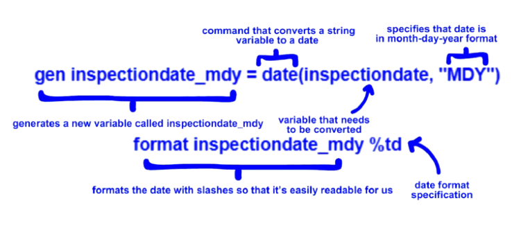
As of currently, Stata is interpreting the inspectiondate variable from the original dataset as a string of characters. We must specify to Stata the variables which hold dates in order for Stata to correctly identify them. To do so, we will generate a new variable called inspectiondate_mdy and format it. gen is the command for generating a new variable.
![]()
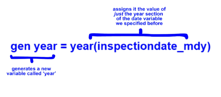
A new column called ‘inspectiondate_mdy’ has been created with date formatting of the original inspectiondate variable. Next, let’s splice just the year from the month, day, and year for use later on. To do so, we will run the following:
![]()
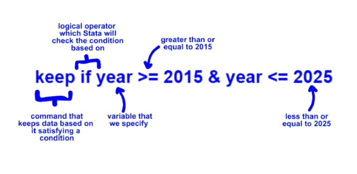
Now that we have separated just the year from the rest of the date, we will want to filter our years to only fall within the last decade (2015-2025). We can run:
![]()
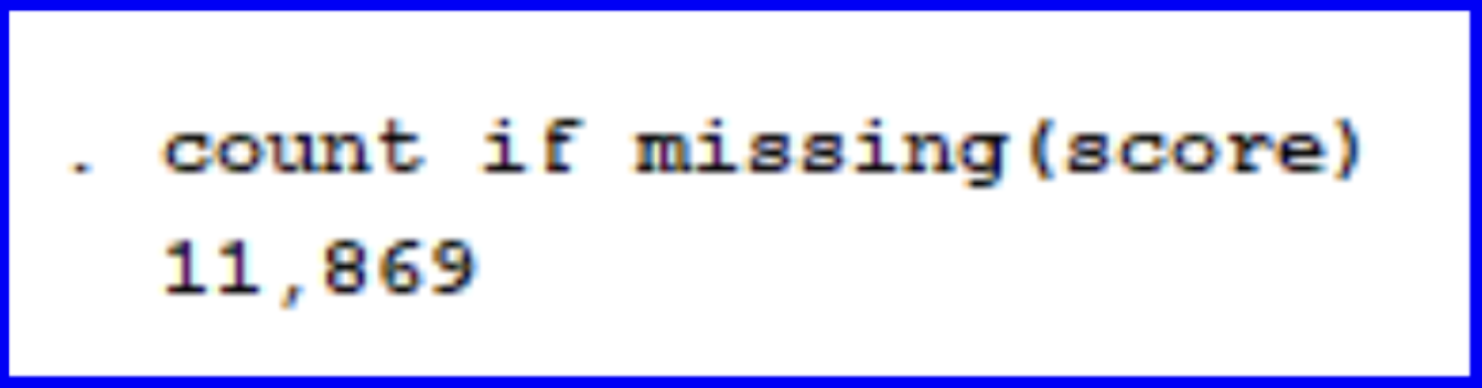
Because we will be using score as our dependent variable within the guide, we will remove all the observations in the dataset that do not have a score listed. When tabulating earlier, we were able to see that the score column has many missing values. Let’s first begin by finding how many missing values are present under the score variable within the last ten years by running the following:![]()
![]()
We can see that there are 11,869 scores missing from the dataset. Next, we can remove these observations from the dataset using the drop command:
We can observe that the ranking of mean scores across boroughs from lowest (best) to highest (worst) is Staten Island, the Bronx, Manhattan, Brooklyn, and then Queens.
We could also learn more about a variable with the sum and codebook commands. The codebook command tells you the data type of the specified variable as well as missing values. Let’s observe the count, mean, and standard deviation for score, a central variable throughout our analyses.
When interpreting the table, we can see that there are 268,781 values populating the score column which have an average value of 24.4 and a standard deviation of 18.3. The range of this variable is from 0 to 168. There are 11,842 missing values found in the dataset.
︎︎︎
Formatting Dates and Filtering Years
As of currently, Stata is interpreting the inspectiondate variable from the original dataset as a string of characters. We must specify to Stata the variables which hold dates in order for Stata to correctly identify them. To do so, we will generate a new variable called inspectiondate_mdy and format it. gen is the command for generating a new variable.
A new column called ‘inspectiondate_mdy’ has been created with date formatting of the original inspectiondate variable. Next, let’s splice just the year from the month, day, and year for use later on. To do so, we will run the following:
Now that we have separated just the year from the rest of the date, we will want to filter our years to only fall within the last decade (2015-2025). We can run:
︎︎︎
Dropping N/As
Because we will be using score as our dependent variable within the guide, we will remove all the observations in the dataset that do not have a score listed. When tabulating earlier, we were able to see that the score column has many missing values. Let’s first begin by finding how many missing values are present under the score variable within the last ten years by running the following:

We can see that there are 11,869 scores missing from the dataset. Next, we can remove these observations from the dataset using the drop command:

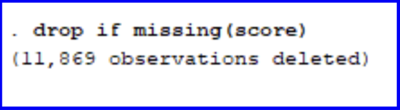
Let’s now double-check that all the observations where score was previously blank have been removed by running browse and looking at the score column.
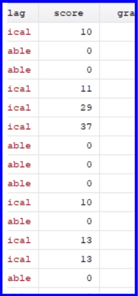
We can see that there are no more dashes representing missing values under the score column. We have now completed a major portion of the data cleaning for our project. Next, let’s move on to encoding variables.
︎︎︎
Encoding Variables
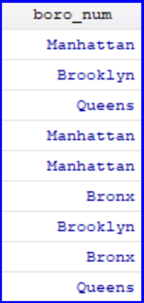
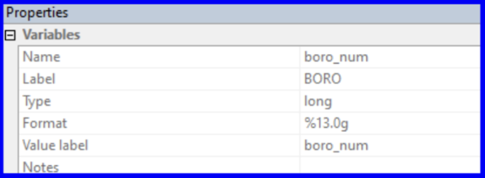
Before we begin using our variables within regressions, we have to tackle a key data cleaning step. A categorical variable holds information on classifications that can be grouped into categories. Within the DOHMH dataset, boro is an example of a categorical variable since the five borough represent distinct categories. Encoding a categorical variable is the process of adjusting it from being read by Stata as a string category to instead assigning it a numeric value (e.g. Bronx = 1, Brooklyn = 2, Manhattan = 3, Queens = 4, and Staten Island = 5). We can then use the newly encoded variable in a variety of commands which only take numeric values (e.g. tabulating, running regressions, and more).
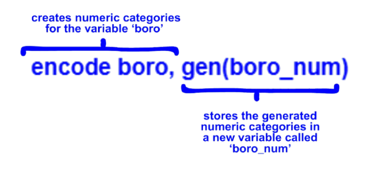
The results of this command won’t be generated in the Results window, but a new column (stylized blue) has been created indicating that the boro variable has been assigned values and its ‘type’ has been updated within the Properties window.
︎︎︎
Creating a Scatter Plot
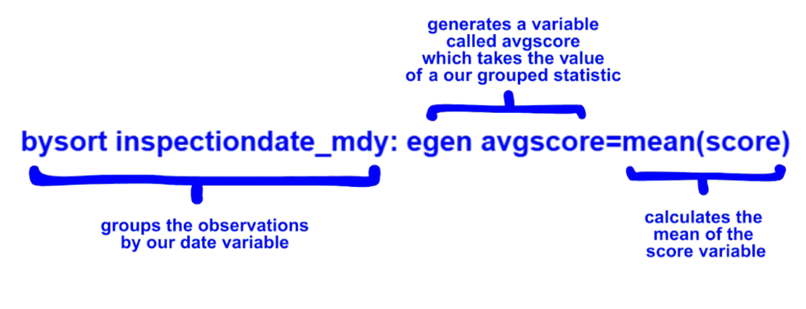
We can also visualize the relationship of the two variables by creating a two way scatter plot of average scores over time. To do this, we will first have to calculate averages for the scores across boroughs. This can be done with the bysort command for grouping and the egen command which creates variables that can take on more complex equations.
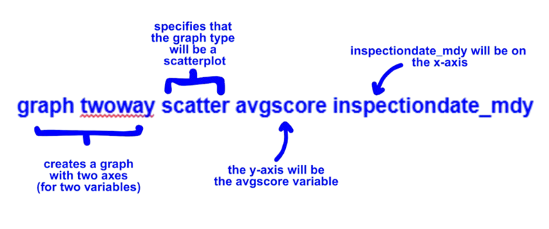
Now we can create a scatter plot for the average score over time. A two way scatter lists the variable on the y-axis followed by the variable on the x-axis.
We can also add a line of best fit with the lfit command which takes the two variables of interest after it:

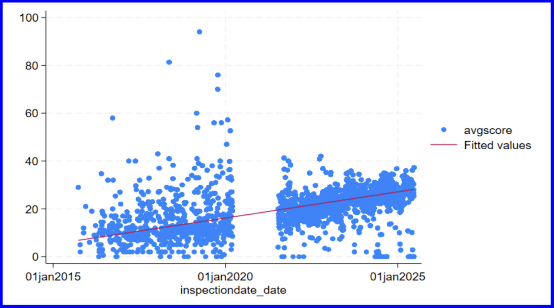
The increase in scores over time can be observed by looking at the upward slope of the line of best fit. Counterintuitively, we must remember that this increase in scores should be interpreted as the DOHMH deeming restaurants as less sanitary and not the other way around. Additionally, we can note the gap in the points plotted beginning in early 2020 as representative of the lack of data collected during COVID.
︎︎︎
Creating a Histogram
You can create visualizations in Stata by directly writing the code with relevant commands, or using the Graphics tab.
We can start off by creating a histogram to see the distribution of the scores.

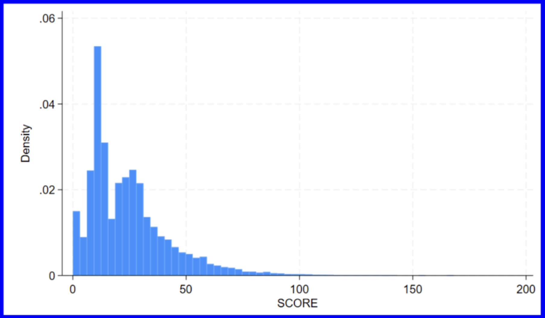
Our histogram shows us that the scores are positively skewed.
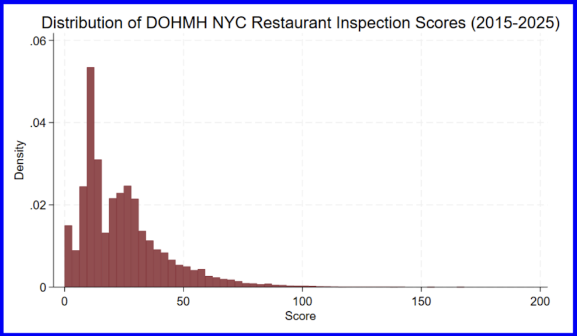
There are many customizable elements of graphical representations in Stata. Some common elements which you will want to update include titles (main, x-axis, and y-axis), bin number, start value, and color. Let’s adjust the previous histogram to include relevant titles and a different color by running the following:

︎︎︎
Box Plots
There are endless options for using Stata to visualize data. This broader cheat sheet of data visualization options provided by Stata can provide you more options. In this guide, however, we will only be covering the common options for data visualizations that you will use more often.
A box plot is a standard way of representing the median, quartiles, and range of a variable.

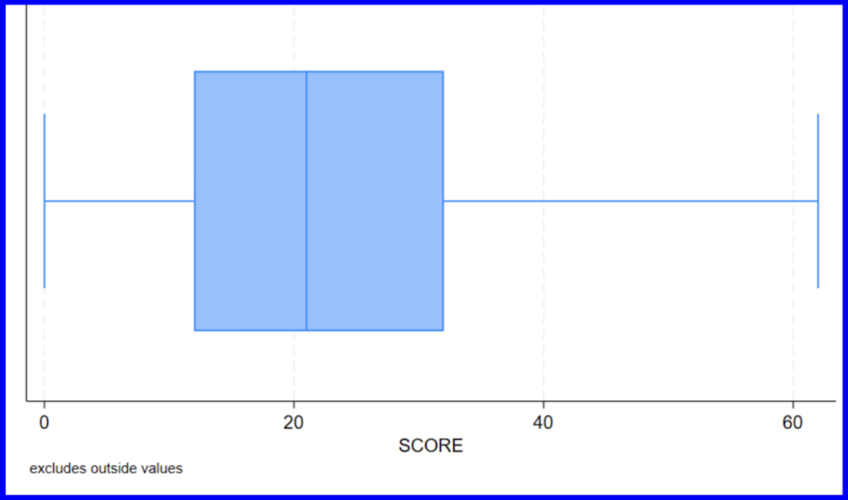
Now we have a standard box plot which shows the minimum, median, maximum, and quartiles of the numeric variable score. The mean of all scores between 2015 and 2025 is shown as being slightly above 20 which aligns with the value given by taking the average of the score column (24.436).
It is also possible to compare distributions by category by having multiple box plots next to one another. Let’s now graph avgscore as sorted by the variable year.

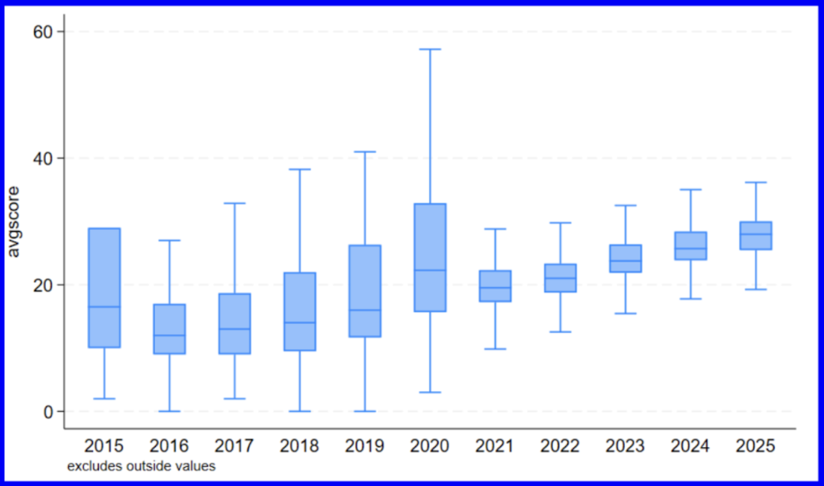
We can now observe the slight variations in the respective medians and quartiles of the average score distributions as classified by the years represented in the dataset. The upward trend in averages across the years mimics what we saw displayed in the scatterplot above indicating that average scores increased over time.
︎︎︎
Correlations and Regressions
What if we wanted to know how scores changed over time (filtered down to the years 2015-2025)? A positive value would indicate that scores increase over time while a negative value would suggest scores are decreasing over time. We could begin by running the following:

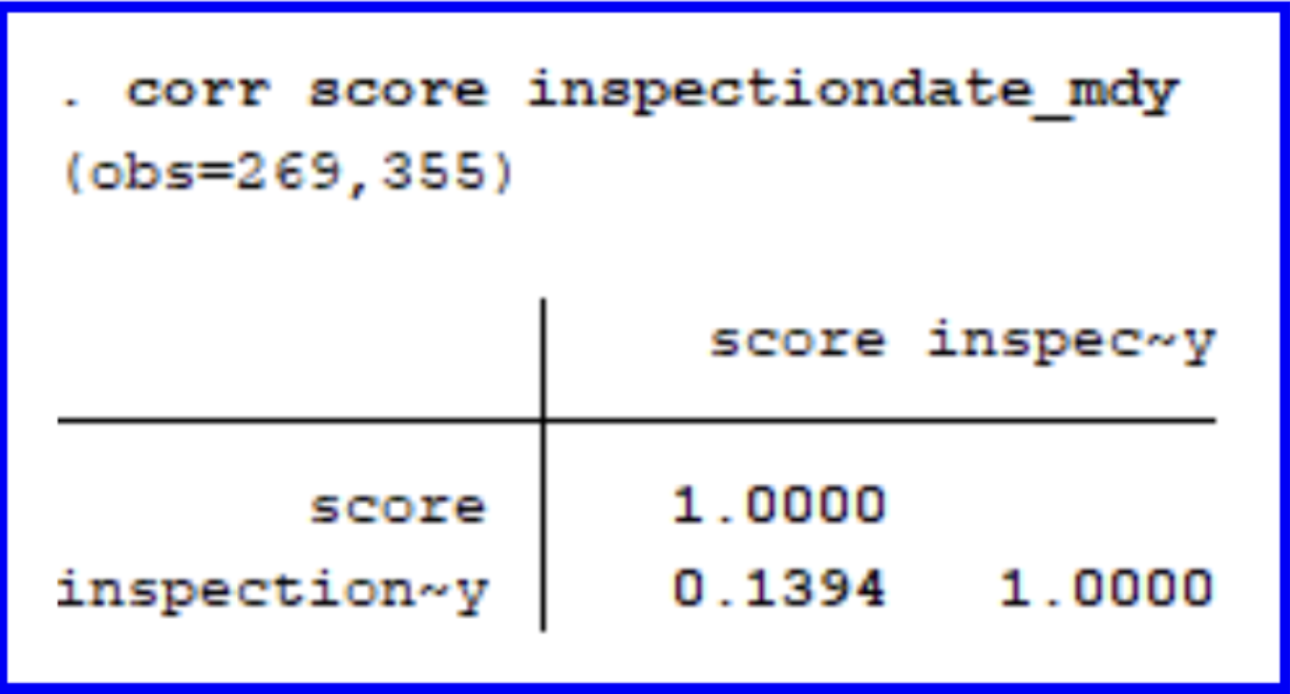
Given the positive correlation coefficient of 0.1394, we can conclude that there is a weakly positive correlation between scores and years where scores are expected to increase slightly over time.
The reg command states the dependent variable followed by

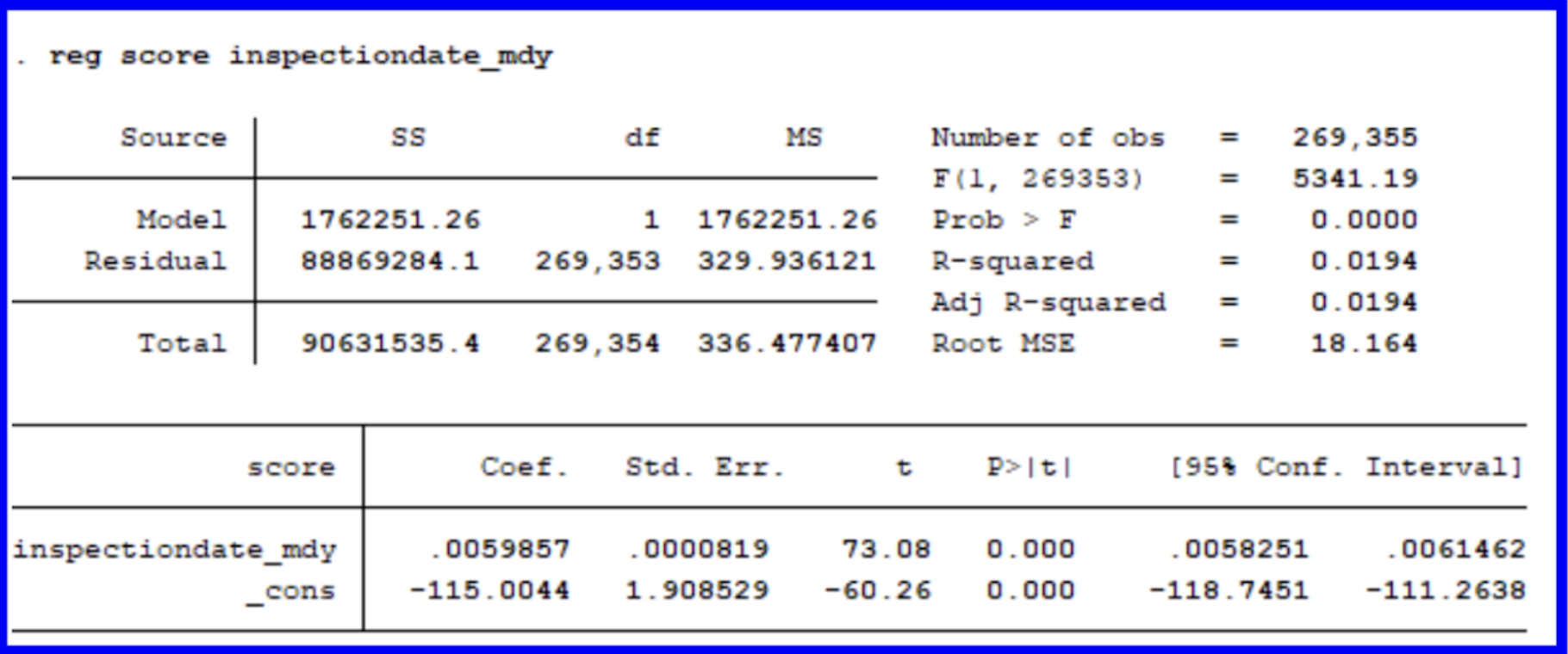
This regression shows us that for our subset taken within a range of 2015-2025, each additional unit of inspectiondate_mdy (which we can interpret as one day), the score will increase by .00599 points. This aligns with what we knew from our earlier summary statistics and graphs which told us that inspection scores have increased slightly over time. There is statistical significance to scores rising over time given our p-value, but we will have to specify more within our model to gain better insights.
︎︎︎
Multivariate Regressions and Interaction Terms
Multivariate regressions are important tools for determining the weight of correlations between different variables. The DOHMH dataset provides a variety of variables which could be correlated with one another. Instead of solely determining the relationship between a dependent and independent variable, we can observe the relationship between multiple outcome variables and gain a more subtle understanding of their interplay.
As a rule of thumb, remember that the independent variable should be listed first in the list. This is the variable that you are examining the impact of all the others onto.
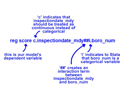
We now want to expand upon our model through the inclusion of the boro_num variable. This is the numeric categorical variable we adjusted earlier which has assigned a number to each borough. We use ‘i.’ before this variable to ensure that Stata reads it correctly as such.
We want to form an interaction term between this variable and our previous inspectiondate_mdy which was included above. To do so, we will use ‘c.’ to specify that inspectiondate_mdy should be treated as a continuous variable.
Let’s run the following to determine how scores differ across borough over time:
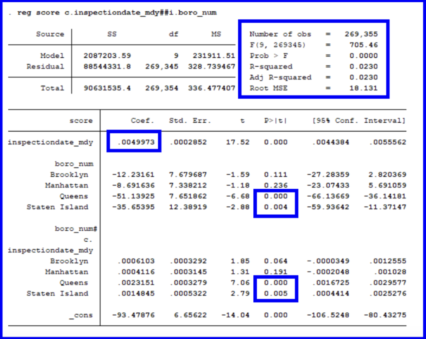
So how can we interpret this regression? To begin, let’s look at the model’s main findings. On average, there is a significant increase in scores over time (as we determined from our univariate regression above).
The differences between boroughs are taken in relation to the Bronx since it has been encoded with a value of 1. This means that we will be comparing the differences across the boroughs in relation to the Bronx. We can determine this since it is missing from being listed in the regression’s output table. On average, there are no significant differences between the scores for Brooklyn and Manhattan in relation to the Bronx, yet there are for Queens and Staten Island (given their p-values are less than 0.005).
Finally, let’s take a look at our interaction term between boroughs and inspection date. This section mirrors the findings of the general inspectiondate_mdy section above given that the increase in scores over time is significant for Queens and Staten Island and insignificant for Brooklyn and Manhattan.
The model is significant overall given its p value of 0.0000. When looking at how to interpret our model overall, we can see that despite Queens and Staten Island starting off with lower (better) scores, they are increasing more rapidly over time. Brooklyn and Manhattan begin with scores more similar to the Bronx (our baseline) while trending more similarly over time. Overall, inspection scores are rising significantly across the period of 2015 to 2025 which might be attributed to harsher inspection criteria in the wake of COVID-19.
Future models could further incorporate the dataset’s other variables including those surrounding critical flags for a more holistic understanding of the dataset.
Congrats on completing your first statistical analyses in Stata! See below for information on resources for further explanation!
︎︎︎
Additional Resources
* Glossary of commands in the ERC’s Stata guide
* Introduction to Stata Basics
from Stata
* Stata Data Analysis, Processing, and Visualizing Cheat Sheets by Dr. Tim Essam and Dr. Laura Hughes
* Princeton’s Online Stata Tutorial
by Oscar Torres-Reyna
For in-person help with using Stata, check the ERC website for information on fellow’s walk-in hours, booking appointments, and upcoming workshops!Guide by: Zoe Pyne