GIS
This workshop covers some foundational information about GIS systems and geo spatial data, learn about map making conventions and learn to access, organize and display data in QGIS, an open source GIS software. We will finalize our map output and learn to export it as a pdf or image file.
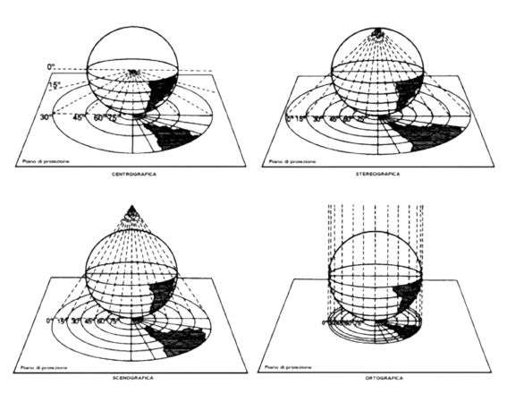
Geographic Information Systems allow you to process, analyze and visualize information about the Earth’s surface. It takes a 3D surface and represents it in a 2D format (screen, paper, etc).
GIS is a flexible tool that allows you to study spatial relationships and output visualizations that take into account relative distance and time. It is utilized by many different fields like environmental science, economics, history, archaeology, urban studies, biology, sustainable development, geology, etc.
![]()
Data Types
Most datasets we work with in GIS contain both a spatial component as well as tabular component (data organized into a table, like you would read in excel). This information is stored in various formats, but today we will be working with what is considered the industry standard, the shapefile.
Shapefiles are stored by your computer as a collection of multiple files that contain different types of information. For example, the .shp file stores information about the geometry, while the .dbf file stores the tabular data. Each shapefile can hold multiple features (which can be points, lines or polygons), and each feature corresponds to a row in the table, with various columns that store attribute information about each feature.
In a GIS model, each shapfile is organized in layers, and can be overlayed and compared to study spatial relationships between various datasets.
Use this link to download QGIS. Download and install QGIS onto your computer.
Use this link to download the zip file that contains the data used in this guide. Download and unzip the file onto your computer.
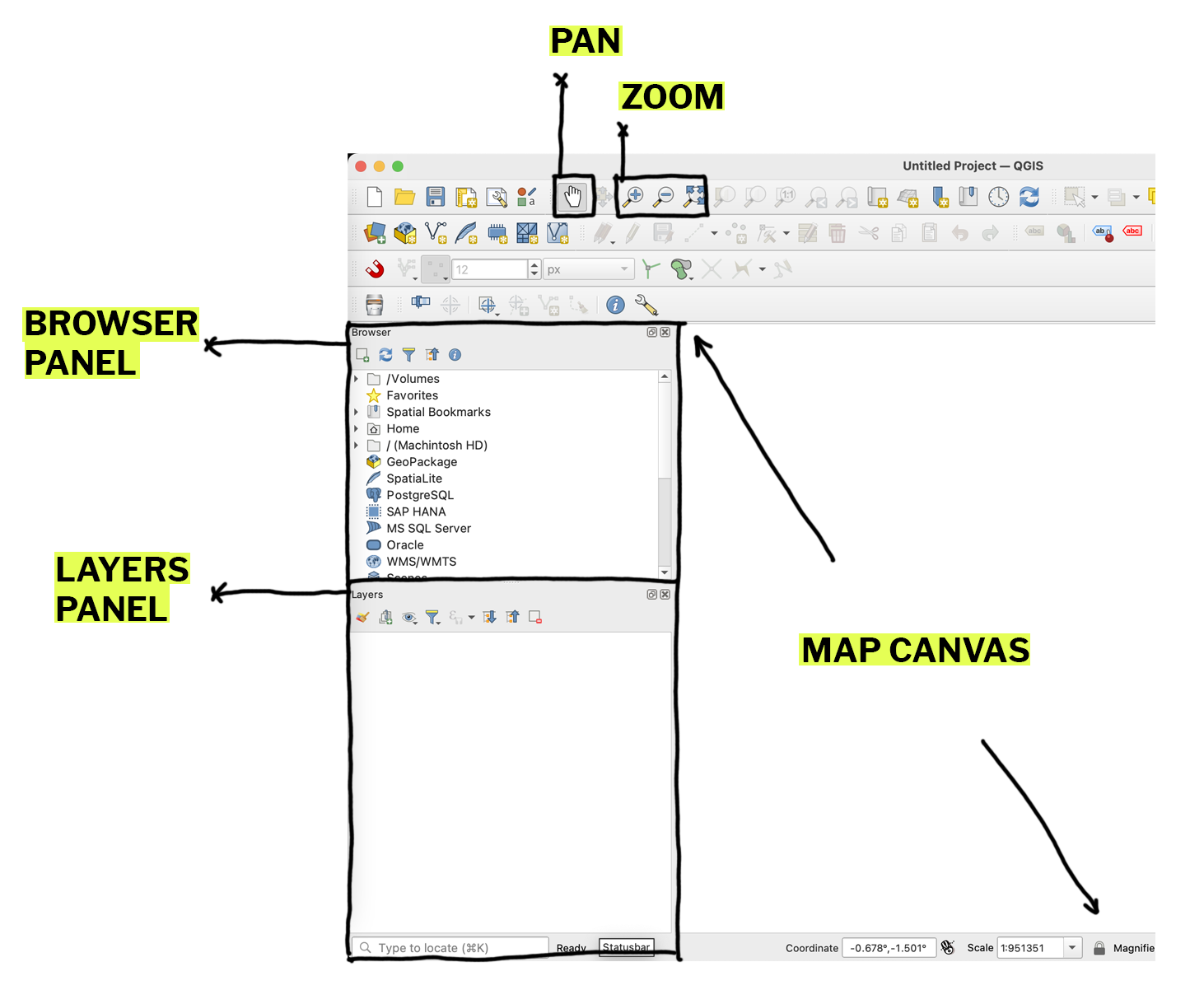
Open QGIS. On the left hand side, you should see a browser and layers panel. If these are missing for you, you can find them under the view tab along the top bar under panels.
There are many ways to add data to your map space in QGIS. In the browser panel, navigate to the folder where you unzipped your data. Drag the shapefile from the browser panel to the map canvas or layers panel. In QGIS, you can also drag and drop the file with the .shp extension directly from your finder window.
![]()
![]()
You can also add data through the layer menu, which gives you more advanced options to import data into QGIS. To add a csv to your project, you can drag and drop it from the browser panel like a shapefile, but you can also import it as a delimited text file. Some benefits to this method is that you can have QGIS automatically detect field types, which can help expedite your work as you start to visualize your data.
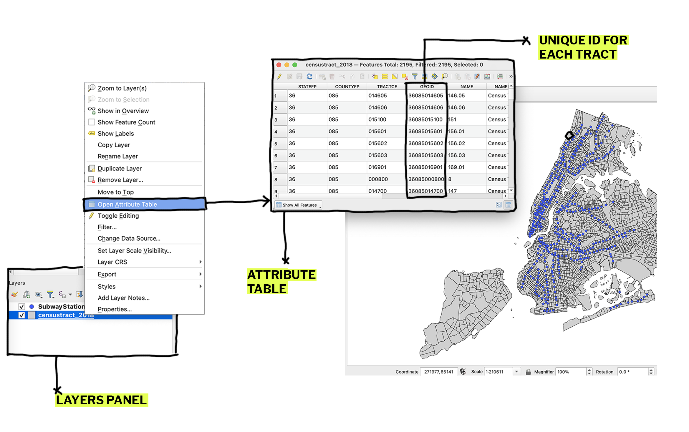
To view the tabular data associated with a layer you can right click on the layer in the layers panel and click on open attribute table. If we take a closer look, we can see that each row in the attribute table corresponds to one census tract, and columns that store information or attributes about the census tracts (tract number, etc).
What is GIS?
Geographic Information Systems allow you to process, analyze and visualize information about the Earth’s surface. It takes a 3D surface and represents it in a 2D format (screen, paper, etc).
GIS is a flexible tool that allows you to study spatial relationships and output visualizations that take into account relative distance and time. It is utilized by many different fields like environmental science, economics, history, archaeology, urban studies, biology, sustainable development, geology, etc.
Data Types
Most datasets we work with in GIS contain both a spatial component as well as tabular component (data organized into a table, like you would read in excel). This information is stored in various formats, but today we will be working with what is considered the industry standard, the shapefile.
Shapefiles are stored by your computer as a collection of multiple files that contain different types of information. For example, the .shp file stores information about the geometry, while the .dbf file stores the tabular data. Each shapefile can hold multiple features (which can be points, lines or polygons), and each feature corresponds to a row in the table, with various columns that store attribute information about each feature.
In a GIS model, each shapfile is organized in layers, and can be overlayed and compared to study spatial relationships between various datasets.
Downloading QGIS and workshop materials
Use this link to download QGIS. Download and install QGIS onto your computer.
Use this link to download the zip file that contains the data used in this guide. Download and unzip the file onto your computer.
Adding Data
Open QGIS. On the left hand side, you should see a browser and layers panel. If these are missing for you, you can find them under the view tab along the top bar under panels.
There are many ways to add data to your map space in QGIS. In the browser panel, navigate to the folder where you unzipped your data. Drag the shapefile from the browser panel to the map canvas or layers panel. In QGIS, you can also drag and drop the file with the .shp extension directly from your finder window.
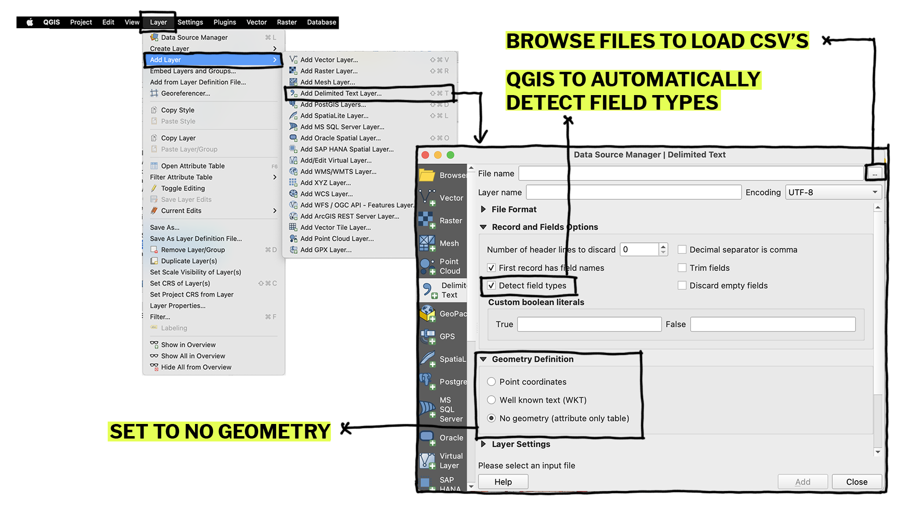
You can also add data through the layer menu, which gives you more advanced options to import data into QGIS. To add a csv to your project, you can drag and drop it from the browser panel like a shapefile, but you can also import it as a delimited text file. Some benefits to this method is that you can have QGIS automatically detect field types, which can help expedite your work as you start to visualize your data.
To view the tabular data associated with a layer you can right click on the layer in the layers panel and click on open attribute table. If we take a closer look, we can see that each row in the attribute table corresponds to one census tract, and columns that store information or attributes about the census tracts (tract number, etc).
Selecting Data
You can select or subset your dataset by using the selection tools along the top toolbar. You have options to select by location or by attributes. For example, if I wanted to select only the census tracts within Manhattan, I could use the polygon selection tool, or filter the attribute table to only include rows where the field COUNTYFP = 061.
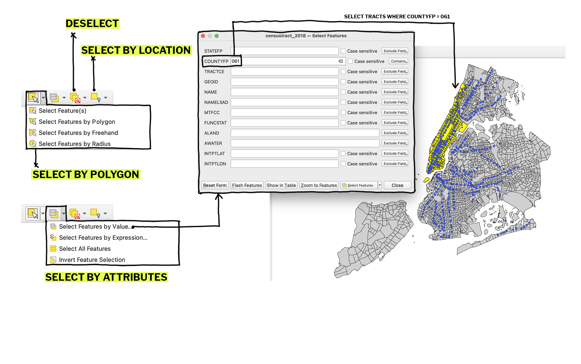
Table Join
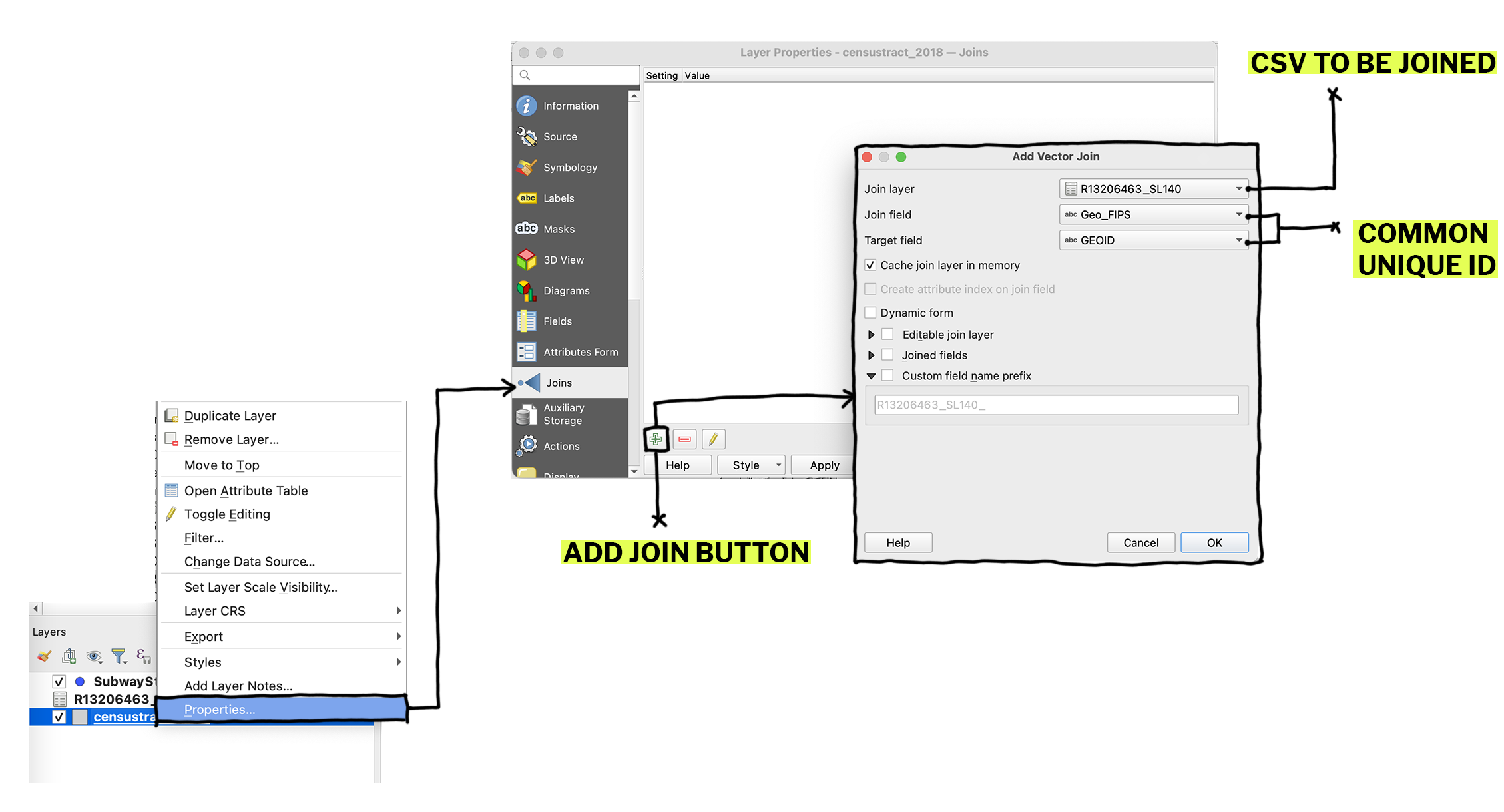
Sometimes a dataset will only contain tabular information. A table join allows you to take the tabular data stored in the csv file and join it to the census tract shapefile based on a common unique identifier. In order to successfully join your datasets, you will need to have a field in your shapefile attribute table that matches a column in your csv file.
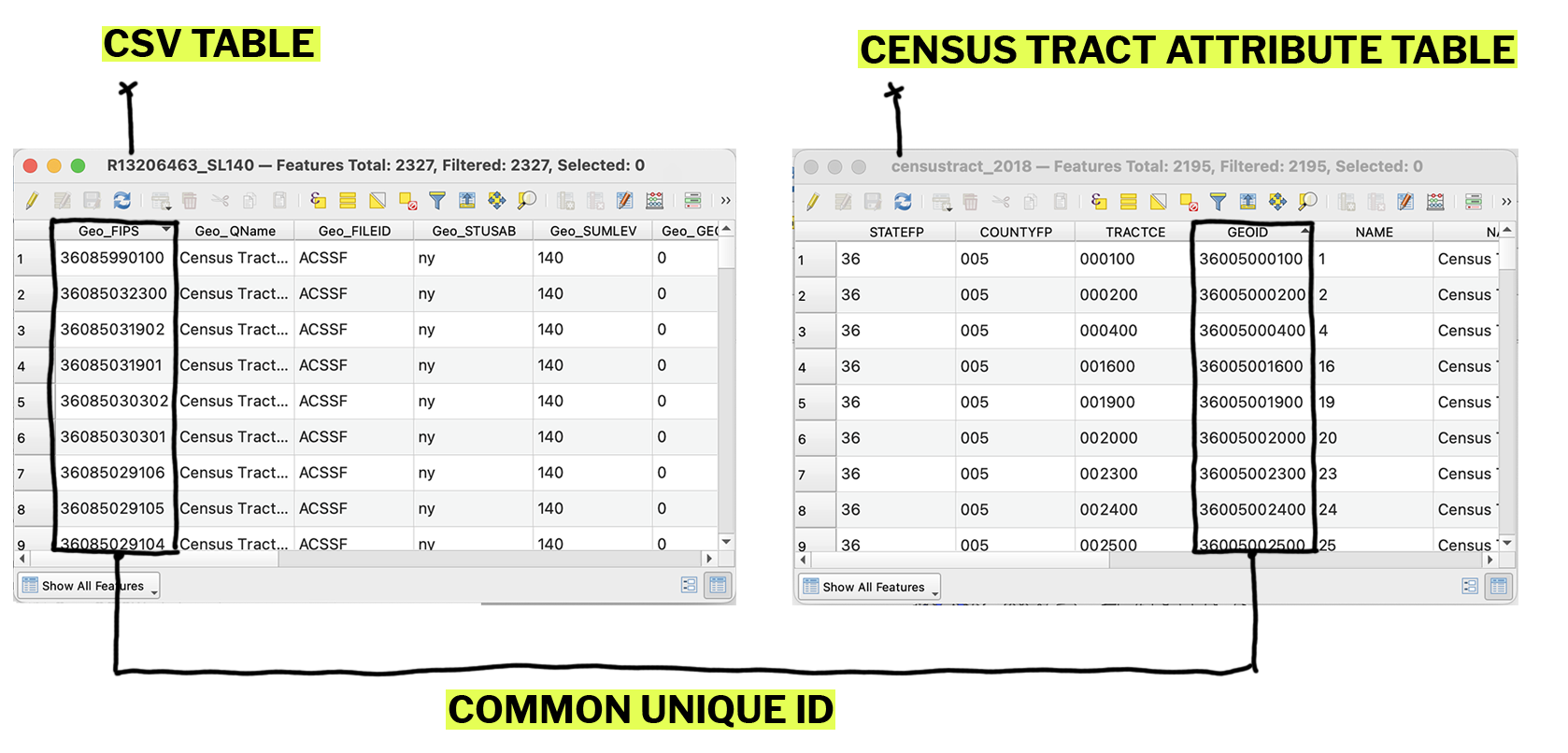
Drag in the csv dataset (R13206463_SL140.csv) from the browser panel. To initate the join, right click on the shapefile layer and click on properties. Navigate to the joins tab on the left and click the green plus sign on the lower right hand corner. Set the join fields to the two fields that match in your datasets.
Classification + Symbology
Symbology refers to the way that we represent data on our maps. For example, we may want to create a graduated color map that shows the median rent per census tract represented along a gradient, where darker colors represent higher rents.
To do this we need to first classify our data. Classifying data divides the dataset into categories or “classes” and assigns colors or symbols to each class.
Right click on the shapefile and click properties and navigate to the symbology tab. By default, the shapefile is symbolized as a single symbol, which means that each census tract in the shapefile is represented the same way on the screen. Change the symbology type to graduated, which will allow us to show values on a gradient. Under value, select the field you want to map, for us that will be median rent. Under mode, you can select your classification method.
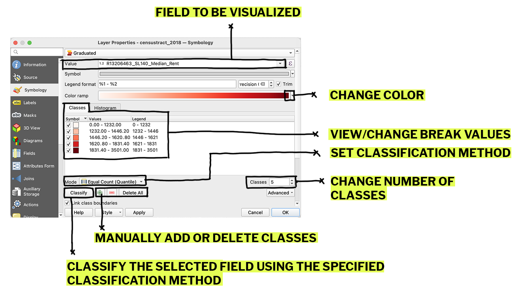
Classification Methods:
There are many ways to classify data, some are more statistically appropriate than others.
There are many ways to classify data, some are more statistically appropriate than others.
- Equal interval takes the range of the data and divides it equally so that the distance between each cut point is the same.
- Quantiles takes all the datapoints and divides them equally into buckets so that there are the same number of data points in each bucket.
- Natural breaks is somewhat in-between these two and uses an algorithm to divide the data to maximize divergence between the breaks and minimize divergence within them.
Layout
Once you’ve classified and symbolized your layers, you can create a new layout to print or export your map view. First, set the extents of your map by using the pan and zoom tools. Under the project tab along the top bar click on create new print layout. Click the add map icon and draw a window on the page where you want your map to appear.
Click on the add legend icon. The legend that is automatically generated is a little messy, so you may want to go into the item properties tab on the right and make some edits.
First uncheck auto update, which will allow you to manually edit your legend entries. Delete any unessessary legend items and rename layers for clarity. You can also reorder your legend entries by dragging them in this window.
To export your map, ...