GETTING STARTED WITH DATA ANALYSIS AND VISUALIZATION IN R
Introduction
This tutorial provides an introduction to data analysis and visualization using two popular R packages: dplyr and ggplot2. These packages are part of the tidyverse ecosystem, which is one of the most used set of packages in R. Please make sure you check out our "Getting started with R" guide before this tutorial, as this tutorial assumes that you know some basics of R and how to get started.
Objectives
- Load and inspect datasets in R
- Clean and rename columns in a dataframe
- Filter, select, group, and summarize data using dplyr
- Create visualizations including bar charts and boxplots using ggplot2
- Combine multiple operations to answer complex data questions
Dataset
We will work with a COVID-19 dataset containing country-level statistics from 2020. We’ll use this dataset to explore confirmed cases, deaths, recoveries, and other metrics across different countries and WHO regions. The data was obtained from kaggle and linked here.
Setting up your environment
Before going into analysis, we need to load the necessary packages. The code below loads dplyr (for data manipulation) and ggplot2 (for visualization). If you haven't installed these packages yet, uncomment the installation lines first. Since dplyr and ggplot2, along with other packages, are under the parent package tidyverse, you can just install tidyverse and load it. Alternatively, you can also install dplyr and ggplot2 individually.
# load packages
library(dplyr)
library(ggplot2)

# if you don't have the packages, install using the command below:
# install.packages('tidyverse') # this package contains both dplyr and ggplot2
# OR
# install.packages('dplyr')
# install.packages('ggplot2')
Loading the data
Next, we set our working directory and load the dataset. The setwd() function tells R where to look for files, and read.csv() imports our CSV file into a data frame called data.
R
# set directory
setwd('/Users/rikac/Downloads')

# load data - this is COVID-19 cases updates in 2020
data <- read.csv('country_wise_latest.csv')
Tip: After loading your data, you can use View(data) to open a spreadsheet view of the data, or head(data) to see the first few rows. This helps you understand what you're working with before you start analyzing.
Data cleaning: renaming columns
Most datasets have messy column names with periods, spaces, or inconsistent formatting. Clean column names make your code more readable. Here, we use the rename() function to replace weirdly-formatted column names with cleaner versions.
Understanding the pipe operator (%>%):
The pipe operator (%>%) takes the output of the expression before it and passes it as the first argument to the next function. Think of it as saying "and then...". It allows you to connect multiple functions together.
R
# change column names of data
data <- data %>% # this sign is called a pipe operator, it simply means "and"
    rename('Country_Region' = 'Country.Region',
           'Deaths_per_100_cases' = 'Deaths...100.Cases',
           'Recovered_per_100_cases' = 'Recovered...100.Cases',
           'Deaths_per_100_Recovered' = 'Deaths...100.Recovered',
           'One_week_change' = 'X1.week.change',
           'One_week_%_increase' = 'X1.week...increase')

# tip = operations are better handled if column names are separated by underscores
Important: Notice that we use data <- data %>% to save our changes back to the original data frame. Without this assignment, R will display the result but won't store it.
Data analysis with dplyr
dplyr provides a grammar of data manipulation to solve the most common data manipulation challenges. The main verbs we'll cover are:
| Function | Purpose |
| select() | Choose which columns to keep |
| filter() | Keep rows that match certain conditions |
| summarise() | Calculate summary statistics |
| group_by() | Group data |
| arrange() | Sort rows by column values |
| mutate() | Create new columns from existing data |
Selecting columns with select()
When working with large datasets, you often only need a subset of columns. The select() function lets you choose exactly which columns to keep. Let’s say we’re interested in keeping the following columns: Country_Region, Confirmed, Deaths, Recovered. We’ll use the pipe operator here as well.
R
# Select only the following columns: Country_Region, Confirmed, Deaths, Recovered
data %>%
    select(Country_Region, Confirmed, Deaths, Recovered)
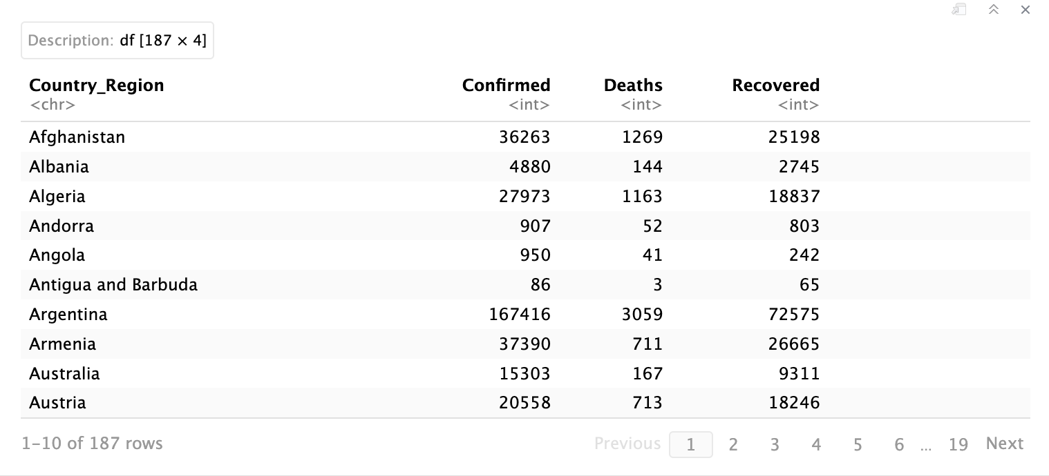
This command just simply shows those columns that you have specified. You can see that in the top right corner, it says “df[187 x 4]” which means that this selected data has 187 rows and 4 columns.
Filtering rows with filter()
The filter() function keeps only the rows that meet your specified conditions. You can use comparison operators like == (equals), < (less than), > (greater than), != (not equal), and combine conditions with & (and) or | (or).
Example 1: Filtering for a specific country
Now, let’s filter to just look at cases of deaths and recovered just in Italy. We’ll filter to just rows corresponding to Italy and use summarise() to calculate the total number of recovered and deaths.
summarise() creates a new data frame as the output. It returns one row for each combination of grouping variables. If there are no grouping variables, the output will have a single row summarising all observations in the input.
![]()
![]()
We add select(Country_Region) at the end to show just the country names rather than all columns. This keeps the output clean.
Filtering rows with filter()
The filter() function keeps only the rows that meet your specified conditions. You can use comparison operators like == (equals), < (less than), > (greater than), != (not equal), and combine conditions with & (and) or | (or).
Example 1: Filtering for a specific country
Now, let’s filter to just look at cases of deaths and recovered just in Italy. We’ll filter to just rows corresponding to Italy and use summarise() to calculate the total number of recovered and deaths.
summarise() creates a new data frame as the output. It returns one row for each combination of grouping variables. If there are no grouping variables, the output will have a single row summarising all observations in the input.
R
# filter to just Italy and view the total number of Deaths and Recovered
data %>%
    filter(Country_Region == "Italy") %>%
    summarise(Total_Recovered = sum(Recovered),
              Total_Deaths = sum(Deaths))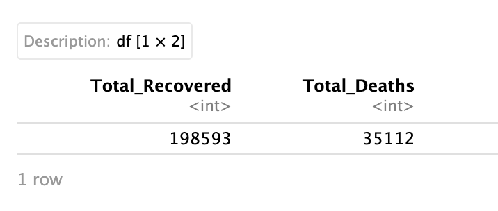
Important: Total_Recovered and Total_Deaths are names you assigned and are not names that exist in the dataset!
Example 2: Filtering with numeric conditions
Now, let’s filter by rows to see countries, where the number of deaths is less than 10.
Example 2: Filtering with numeric conditions
Now, let’s filter by rows to see countries, where the number of deaths is less than 10.
R
# filter by rows to show countries where number of deaths is less than 10
data %>%
    filter(Deaths < 10) %>%
select(Country_Region) 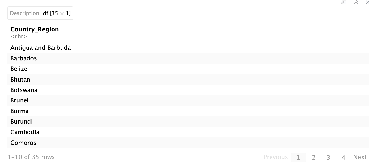
We add select(Country_Region) at the end to show just the country names rather than all columns. This keeps the output clean.
Grouping and summarizing with group_by() and summarise()
Here, we’ll be performing calculations on grouped data. The group_by() function splits your data into groups, and summarise() then calculates statistics for each group separately.
The arrange() function sorts your results. Use desc() inside arrange() to sort in descending order (largest to smallest).
![]()
Here, we’ll be performing calculations on grouped data. The group_by() function splits your data into groups, and summarise() then calculates statistics for each group separately.
The arrange() function sorts your results. Use desc() inside arrange() to sort in descending order (largest to smallest).
R
# Show top WHO region by total confirmed cases
data %>%
    group_by(WHO.Region) %>%
    summarise(Total_Cases = sum(Confirmed)) %>%
    arrange(desc(Total_Cases))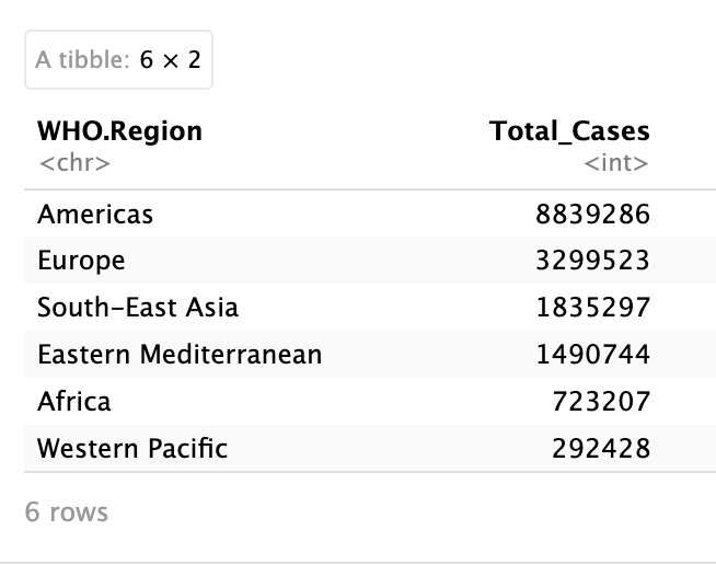
This pipeline reads as follows: "Take the data, group it by WHO region, calculate total cases for each region, then arrange from highest to lowest."
Creating new columns with mutate()
The mutate() function creates new columns based on calculations from existing columns. This is essential when you need derived metrics that don't exist in your data yet (e.g. rates or percentages). For example, if we want to have a column that represents the percentage of females of the total population, we can take the column that shows the number of females divided by the column that shows the total population.
The Death_Rate column now permanently exists in our dataset. This column tells us what proportion of confirmed cases resulted in death for each country.
ggplot2 is a package for data visualization, where you can do tons of customizations for your plots. Every ggplot2 chart is built from the same components:
The basic syntax is as follows:
Bar Charts with geom_bar()
Bar charts are ideal for comparing quantities across categories. Let's visualize confirmed COVID-19 cases across Southeast Asian countries.
![]()
Understanding stat = 'identity'
By default, geom_bar() counts the number of rows for each category. However, our data is already aggregated with each row representing a country with its total case count. Setting stat = 'identity' tells ggplot2 to use the actual values in the Confirmed column rather than counting rows.
Now, let’s look at the comparison of death rates between WHO regions using boxplots.
Box Plots with geom_boxplot()
Box plots show the distribution of a numeric variable. They display five key statistics: minimum, first quartile (25th percentile), median (50th percentile), third quartile (75th percentile), and maximum. Outliers appear as individual points beyond the whiskers.
Now, let’s look at the comparison of death rates between WHO regions using boxplots.
![]()
Creating new columns with mutate()
The mutate() function creates new columns based on calculations from existing columns. This is essential when you need derived metrics that don't exist in your data yet (e.g. rates or percentages). For example, if we want to have a column that represents the percentage of females of the total population, we can take the column that shows the number of females divided by the column that shows the total population.
R
# let's create a new column called Death_Rate, where we take the number of deaths divide by the
# number of confirmed cases

data <- data %>%
    mutate(Death_Rate = Deaths / Confirmed)

# again, we save it back to the dataset by using the 'data <-', otherwise the new column will not be saved!Data visualization with ggplot2
ggplot2 is a package for data visualization, where you can do tons of customizations for your plots. Every ggplot2 chart is built from the same components:
- Data: The dataset you're visualizing
- Aesthetics (aes()): How variables map to visual properties (x-axis, y-axis, color, size)
- Geometries (geom_*): The type of plot (bars, points, lines, boxes)
- Labels and themes: Titles, axis labels, and styling
The basic syntax is as follows:
R
ggplot(data, aes(x = variable1, y = variable2)) +
    geom_*() +
    labs() +
    theme()
Bar charts are ideal for comparing quantities across categories. Let's visualize confirmed COVID-19 cases across Southeast Asian countries.
R
# first, we have to subset the data to only countries within South-East Asia

sea_countries <- data %>%
                    filter(WHO.Region == 'South-East Asia')


g1 <- ggplot(sea_countries, aes(x=Country_Region, y=Confirmed)) +
        geom_bar(stat = 'identity', fill='steelblue') +
        labs(title = 'Number of confirmed cases in countries in Southeast Asia WHO region',
             x = 'Countries',
             y = 'Number of confirmed cases')

print(g1) # since we save the plot to g1, type this command to view the plot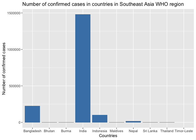
Understanding stat = 'identity'
By default, geom_bar() counts the number of rows for each category. However, our data is already aggregated with each row representing a country with its total case count. Setting stat = 'identity' tells ggplot2 to use the actual values in the Confirmed column rather than counting rows.
Now, let’s look at the comparison of death rates between WHO regions using boxplots.
Box Plots with geom_boxplot()
Box plots show the distribution of a numeric variable. They display five key statistics: minimum, first quartile (25th percentile), median (50th percentile), third quartile (75th percentile), and maximum. Outliers appear as individual points beyond the whiskers.
Now, let’s look at the comparison of death rates between WHO regions using boxplots.
R
# now, let's look at the comparison of death rates within WHO regions

g2 <-  ggplot(data, aes(x = WHO.Region, y = Death_Rate)) +
            geom_boxplot(fill='pink') +
            labs(title = 'Death Rates across WHO regions',
                 x = 'WHO regions',
                 y = 'Death rates')

print(g2)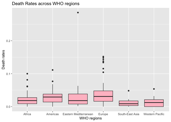
Interpreting box plots: From this visualization, we can observe that Europe has the highest median death rate (the line in the middle of the box), but there's significant variation within each region. The dots represent outliers (countries with unusually high or low death rates compared to other countries).
Faceted plots with facet_wrap()
Faceting creates multiple small plots split by a categorical variable. This is powerful for comparing patterns across different groups. Let's compare confirmed cases, deaths, and recoveries across all WHO regions. This requires some data preparation first:
Reshaping Data for Visualization
ggplot2 works best with "long" data where each row represents a single observation. Our region_totals data is currently in "wide" format. We need to restructure it so each row contains one region, one case type, and one count:
What's happening here?
Now we can create our faceted visualization:
![]()
The facet_wrap(~WHO_region) splits the plot into separate panels for each WHO region, making it easy to compare patterns across regions at a glance.
More resources:
- R for Data Science
By: Rika Chan
Faceted plots with facet_wrap()
Faceting creates multiple small plots split by a categorical variable. This is powerful for comparing patterns across different groups. Let's compare confirmed cases, deaths, and recoveries across all WHO regions. This requires some data preparation first:
R
# first, we need to summarize each case type

region_totals <- data %>%
                    group_by(WHO.Region) %>%
                    summarise(Confirmed = sum(Confirmed),
                              Deaths = sum(Deaths),
                              Recovered = sum(Recovered))

# view region_totals to make sure you understand the purpose of this step
Reshaping Data for Visualization
ggplot2 works best with "long" data where each row represents a single observation. Our region_totals data is currently in "wide" format. We need to restructure it so each row contains one region, one case type, and one count:
R
# now, we need to make a new dataframe that summarizes the different of types of cases for each region
region_cases <- data.frame(
                    WHO_region = rep(region_totals$WHO.Region, each = 3),
                    Case_Type = rep(c("Confirmed", "Deaths", "Recovered"), times = nrow(region_totals)),
                    Count = c(region_totals$Confirmed, region_totals$Deaths, region_totals$Recovered))

# view region_cases to see the purpose of this step
- rep(..., each = 3) repeats each region name 3 times (once for each case type)
- rep(..., times = nrow()) cycles through the case types for each region
- We combine the counts from all three columns into a single vector
Now we can create our faceted visualization:
R
# now, let's plot!
g3 <- ggplot(region_cases, aes(x = Case_Type, y = Count)) +
        geom_bar(stat = "identity", fill = 'lightgreen') +
        labs(title = "Total COVID-19 case types across WHO regions (2020)",
            x = "Case types",
            y = "Total Count") +
        facet_wrap(~WHO_region) +
        theme(legend.position = "none")print(g3)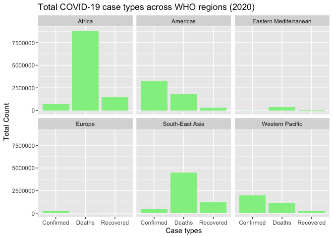
The facet_wrap(~WHO_region) splits the plot into separate panels for each WHO region, making it easy to compare patterns across regions at a glance.
More resources:
- R for Data Science
By: Rika Chan